

Why Most AR Software Buyers Compare Features Instead of Collection Outcomes

Key Takeaways
- The best AR automation software gets you paid faster while keeping customers happy. Not the one with the longest feature list.
- Teams spend weeks ranking features like AI-powered dunning, then pick tools that barely touch their DSO.
- Checklists win because a sales sheet with 40 checkmarks feels concrete. Cash-recovery projections feel abstract until you’ve already signed.
- Procurement scorecards tend to weight feature count over KPI impact, so tools with more ticked boxes score better on paper.
- Vendor terms like “AI-powered” and “fully customizable” sell demos. They tell you nothing about whether overdue invoices get paid sooner.
- Collection outcomes reach past your cash balance. They shape churn, lifetime value, and credit risk.
- Outcome-based product thinking says progress should be judged by outcomes, not features shipped. That applies to buying software, not just building it.
Why Collection Outcomes Beat Feature Lists
The best accounts receivable automation software isn’t the one with the longest feature list. It’s the one that gets you paid faster while keeping customers happy. That distinction disappears the moment a buyer opens a comparison spreadsheet.
We see it constantly. Teams evaluating AR automation spend weeks ranking features like “AI-powered dunning” and “customizable portals,” then pick a tool that barely moves their DSO. The features looked impressive. The collection outcome didn’t budge.
Our stance: measure what a tool does to your cash, not what it lists on a page. Progress gets judged by outcomes achieved, not features shipped. That principle comes straight from outcome-based product thinking, and it applies just as sharply to buying software as building it.
Why Do Feature Checklists Win Over Outcome Data?
Checklists win because they’re easier to digest. A sales sheet with 40 checkmarks feels concrete. A projection about cash recovery feels abstract and unprovable until you’ve committed.
Procurement scorecards make it worse. Most weight feature count higher than KPI impact, so the tool with more boxes ticked wins on paper. Confirmation bias handles the rest. Buyers equate more features with more value, even when the extra features never touch collections.
Vendor marketing feeds the loop. “AI-powered” and “fully customizable” sell demos. They don’t tell you whether your overdue invoices get paid sooner, or whether the customer still renews after the third reminder.
What Do Collection Outcomes Actually Affect?
Collection outcomes ripple past your cash balance. They shape churn, customer lifetime value, and credit risk. A rushed, robotic dunning sequence recovers the invoice but bruises the relationship. A well-timed, human-sounding nudge recovers the cash and keeps the account.
This is the stage most buyers ignore: the post-collection customer experience. What happens after you send the overdue notice decides whether that customer feels chased or supported. Automation that treats a late payer like a valued client protects retention. Automation that treats them like a delinquent quietly raises churn.
Consider the mid-size agency that spends four months comparing 12 features across vendors, then picks the tool with the fullest checklist. Meanwhile a competitor’s prioritization engine is recovering more cash by chasing the right invoices first, without souring good relationships. The agency optimized for features and left the outcome on the table.
Which Businesses Feel This Most?
Outcome-first buying matters most where payment cycles run long and volume runs high. Three groups feel it hardest:
- High-volume subscription businesses: small DSO gains compound across thousands of invoices.
- B2B wholesale: thin margins mean every recovered day of cash counts.
- Professional services: agencies and consultancies with long terms and relationships worth protecting.
For these teams, reducing DSO by even a week on a meaningful ARR base can free up substantial working capital. That’s not a feature. That’s payroll, a hire, or runway.
| Buying Approach | What It Measures | What It Misses |
|---|---|---|
| Feature checklist | Capability count | Actual cash recovered, retention impact |
| Outcome-based | DSO reduction, churn, recovery rate | Nothing that matters to the P&L |
The recommendation is simple. Before you rank a single feature, define the outcome you’re buying: fewer days sales outstanding, higher recovery rates, and customers who stay. Then judge every tool, ours included, against that. Blixo is built around those outcomes: Collections AI to automate dunning and chasing, Cash Application AI to match payments to invoices, and Retention AI to prevent delinquent churn, all from one platform.
The Hidden Cost of Ignoring Collection Outcomes
Ignoring collection outcomes drains cash slowly, not in one dramatic write-off. It leaks out through weak dunning logic, delayed follow-ups, and payment cycles that stretch longer than they should.
Pick accounts receivable automation software on features alone, and you inherit every one of those leaks. The tool looks capable on the demo screen. Then your DSO barely moves, your analysts stay buried in manual work, and your customers still feel nagged instead of helped.
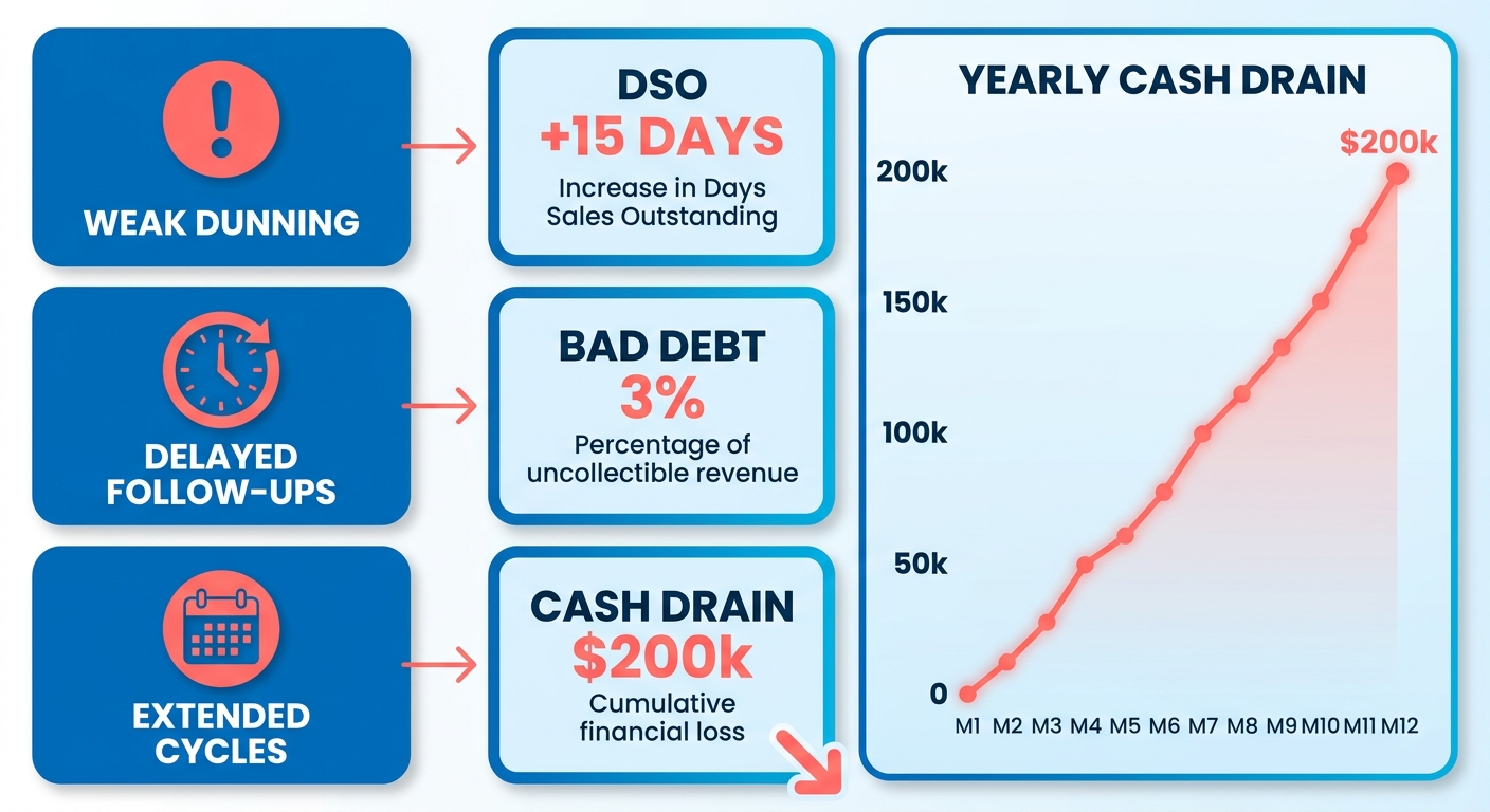
The costs of that neglect stack across several areas.
What Does Feature-First Buying Cost in Real Dollars?
The hidden costs stack across four areas: lost cash, wasted labor, higher bad debt, and slower growth. Each traces back to the same root cause. The software optimized for a spec sheet, not for getting paid while keeping the relationship intact.
Manual reconciliation is the quiet budget killer. AR teams burn hours every week matching payments to invoices when the work isn’t automated. That’s time a tool should handle. Multiply it across a team and you’re funding a role in busywork. Automated matching pairs incoming payments with open invoices instantly, which pulls that load off your finance team.
Bad debt exposure widens too when reminder logic is generic. Multi-channel outreach reaches customers on the channels they actually use, while proactive churn prevention guards the relationship. That targeting narrows the gap a feature-only comparison ignores.
| Cost Area | Feature-First Tool | Outcome-Optimized Platform |
|---|---|---|
| Cash tied up in receivables | High | Materially lower |
| Analyst time on reconciliation | Manual, hours/week | Automated with Cash Application AI |
| Overdue accounts | Generic reminders | Automated collections & dunning |
| Customer payment experience | Friction, churn risk | Relationship-building |
Why Does Slow Cash Hurt More Than the Numbers Show?
Slow cash flow doesn’t just sit on a spreadsheet. It caps what you can do next. Money stuck in receivables is money you can’t put toward hiring, product work, or a new market push.
That’s the opportunity cost nobody lines up in the comparison. Every extra week a payment sits unpaid is a week you can’t reinvest. Growth-stage teams feel this hardest, because their runway depends on cash converting fast.
The retention angle is the piece feature lists ignore entirely. Longer payment cycles mean more overdue notices, more awkward reminders, more friction with customers who might otherwise renew happily. A clumsy dunning sequence trains good customers to dread your emails.
Outcome-optimized AR automation flips that. The same overdue moment becomes a chance to send a clear, respectful nudge that makes paying easy. A self-service portal lets clients clear a balance on their own terms, which turns a tense touchpoint into a quick transaction. That’s the difference between chasing money and keeping a relationship.
The conclusion is straightforward. If a tool can’t show you what it does to your write-offs, your DSO, and your churn, its feature count is noise. The cost of ignoring outcomes shows up in all three places, whether you measured it or not.
From Metrics to Decision: An Outcome-Driven Scorecard
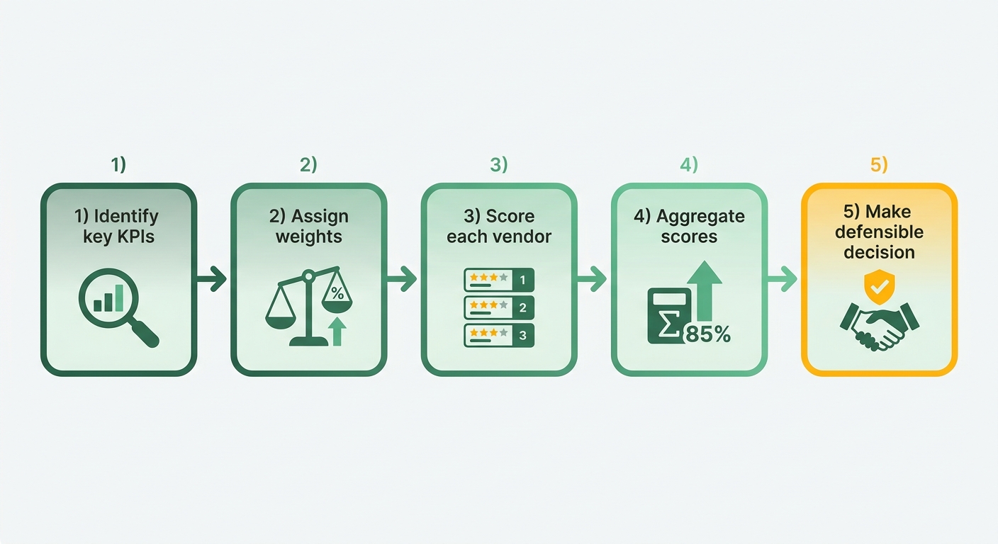
Turn a feature checklist into an outcome scorecard: pick the KPIs that actually move your cash, weight them by what your business needs, and score each vendor on real data. You end up with a defensible number, not a gut feeling.
This is where most evaluations fall apart. Teams collect impressive demo notes, then have no way to translate them into a decision. A weighted rubric fixes that. It forces every vendor through the same outcome lens, including how each one handles the customer after an invoice goes overdue.
What KPIs Actually Belong in an AR Scorecard?
Five outcome KPIs matter most: DSO reduction, cash-recovery percentage, bad-debt reduction, automation ROI, and implementation speed. Skip vanity metrics like “number of templates” or “dashboard count.” Those tell you nothing about whether you get paid faster or keep the customer.
Add one more we rarely see on comparison sheets: post-collection retention impact. Does the tool let you send an overdue notice that reads like a helpful nudge, not a threat? A dunning sequence that keeps a good customer is worth more than one that squeezes cash and burns the relationship.
Judging software this way shifts the focus from a vendor’s roadmap to your own balance sheet. You’re measuring impact on your financial health and your retention, not their feature velocity.
How Should You Weight the Metrics?
Weight by your biggest problem, then score each vendor 1 to 10 per KPI and multiply. A cash-strapped agency weights DSO heavily. A firm bleeding good clients weights retention and recovery experience higher.
A starting rubric you can adapt:
| Outcome KPI | Suggested Weight | What a 10 Looks Like |
|---|---|---|
| DSO reduction | 35% | Pilot cuts DSO by double digits |
| Cash-recovery % | 25% | Recovers most aging invoices without manual chasing |
| Retention-safe dunning | 15% | Overdue flows read as service, drive repeat business |
| Automation ROI | 15% | Analyst hours drop sharply, payback under a year |
| Implementation speed | 10% | Live and collecting in weeks, not quarters |
Adjust the percentages, but keep them adding to 100. Weighting is where your context enters the math. Two buyers can score the same tool differently and both be right.
Pull your scoring data from three places: demo-phase outcome simulations, pilot results on your own invoices, and third-party benchmarks like G2 ratings. Trust the pilot most. A vendor’s simulation is a sales asset. Your pilot is evidence.
What Is Outcome Gap Analysis?
Outcome gap analysis compares a feature-heavy vendor’s score against your weighted target, then names exactly where it falls short. A tool can win on feature count and still lose the weighted total. That gap is your answer.
Run it like this. Circle any KPI where a vendor scores below 6 but carries a weight above 15%. That’s a disqualifier, no matter how slick the demo looked.
The most common gap we see? Strong automation, weak retention. Tools automate the chase but treat every overdue account like a delinquent. Score that honestly. If your growth depends on repeat customers, a vendor that automates cash but corrodes relationships isn’t cheaper. It’s more expensive in churn you won’t see until renewal.
Leading AR Platforms, Judged on Outcomes
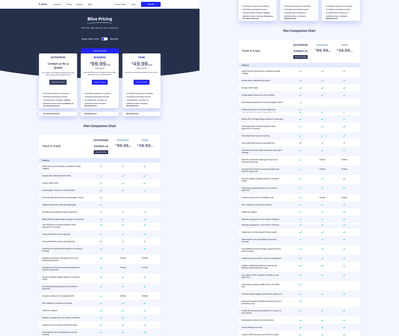
Here’s how five popular AR platforms stack up when you judge them by collection outcomes instead of feature counts. The comparison is built around the metrics that actually move cash: DSO reduction, cash-recovery percentage, bad-debt decline, automation ROI, and implementation time. Plus something most comparisons skip: how each tool treats customers after an invoice goes overdue.
That last point matters. The best software doesn’t just chase payments faster. It handles the awkward overdue moment in a way that keeps the customer wanting to work with you next quarter. Speed without relationship care just means you collect this invoice and lose the account.
How Do the Leading AR Platforms Compare on Outcomes?
The short version: Blixo focuses on automated collections and intelligent cash application, Collectly brings a deep feature set at slower rollout, and the ERP-native options trade weaker collection lift for tight financial integration. Below is what each choice means in practice.
Which Platform Wins on Collection Outcomes?
Blixo runs billing, collections, and cash application inside one workflow. Because those functions share data, automated reminders always fire off real-time payment status, so you’re not chasing accounts that already settled. That keeps customer goodwill intact while cash recovery speeds up. Our guide to essential AR features breaks down the mechanics.
Collectly carries a genuinely strong feature set and modern portals, but the outcome-to-effort ratio runs behind. The rollout stretches longer than most teams expect, and pricing sits at the higher end. Solid tool. It just asks for more setup work before the collection gains show up.
Zuora RevPro shines at subscription and usage billing. On collections it’s modest, with limited AI dunning and a premium price. Buy it for revenue recognition, not for recovering overdue cash.
What About the ERP-Native Options?
Sage Intacct and Oracle NetSuite win on integration, not collection lift. Intacct pairs medium implementation with average automation ROI, so DSO movement stays incremental. NetSuite offers enterprise-grade depth, but the multi-month rollout and high total cost of ownership push the payback date well out.
Both treat overdue notices as transactional. The dunning fires, the customer feels processed, and the relationship takes a small hit each cycle. For finance teams already living inside these ERPs, that trade may be worth it. For teams where retention drives revenue, it usually isn’t.
The one-sentence takeaway: most buyers rank these tools by feature depth and land on the platform that barely moves their DSO while quietly eroding customer goodwill.
Deep Dive: Why Blixo Wins on Collection Outcomes
We built our product around one question: does it get you paid faster while keeping the customer relationship intact? That second half is where most tools quietly fail. They collect the invoice and burn the account.
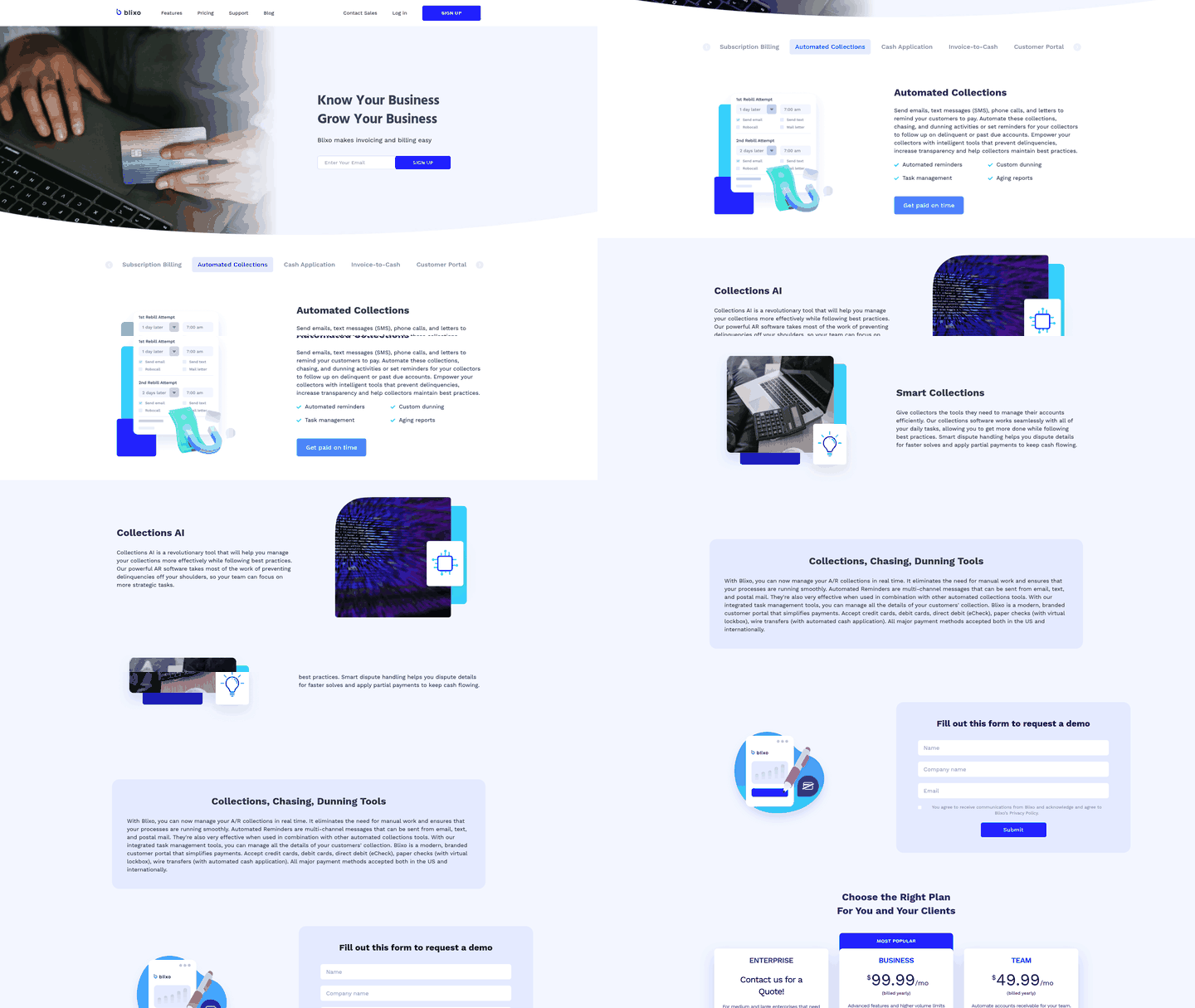
Our approach treats the overdue moment as a relationship checkpoint, not just a cash event. The Collections AI engine automates collections, dunning, and chasing so accounts get the right touch at the right time. That distinction matters. A customer who’s late because of a billing error deserves a different message than a chronic slow-payer, and treating them the same is how you lose good accounts.
How Does the Collections AI Cut Chase Time?
The system sorts outstanding accounts by risk profile and payment history, then points your team where it’s needed most. Instead of manually working through aging reports, collectors get automated tasks for high-priority accounts while low-risk balances clear through gentle automated workflows.
That’s what turns dunning into something customers don’t resent. Rather than blasting identical overdue notices, you tune tone and timing. The late-because-of-a-glitch customer gets a helpful nudge. The relationship survives the reminder.
Why Does Unified Cash Application Matter for Retention?
Closing the gap between payment receipt and ledger reconciliation is what keeps customer trust intact. When payment matching happens instantly, the odds of firing an overdue notice at someone who already paid drop to near zero. Your collection team always works from accurate, current balances.
The real-time revenue dashboard closes the loop. As a single source of truth for reconciled revenue, it shows your team exactly where cash sits before a follow-up goes out. That prevents the misfires that erode trust. Our accounts receivable software features breakdown covers how these pieces fit together.
How Does It Improve Outcomes?
| Capability | Blixo |
|---|---|
| Collections | Automated across email, SMS, phone, and letters |
| Cash application | Intelligent matching with high accuracy |
| Revenue visibility | Single source of truth, real-time |
| Retention | Retention AI to prevent delinquent churn |
| Integrations | QuickBooks, Xero, NetSuite, and custom ERPs |
Blixo is an all-in-one replacement for subscription management, invoicing, collections, and cash application software. Instead of stitching several tools together, you run recurring billing, automated collections, cash application, and reconciliation from one platform. Which is why customers tired of clunky, overpriced systems make the switch.
Our customers tell it better than a spec sheet:
“The chasing setting is interesting and makes it easier to collect outstanding invoices.” — Stacey, Blixo customer
What Makes the Approach Work?
The platform is built to pull friction out of the whole payment lifecycle. Combine automated billing with intelligent recovery workflows and you keep cash flowing without sacrificing the customer experience. The focus stays on faster recovery and protected relationships.
Skip us if you want a bare-bones invoicing tool and don’t care how overdue accounts feel afterward. But if retention and getting paid faster both matter, this is the dimension where we win clearly: turning collection into a moment that keeps customers, not just cash.
Test Outcomes Before You Buy: Walkthroughs and Edge-Case Trials
A live demo shows you what a tool can do. A sandbox trial shows you what it will do to your cash and your customer relationships. Different questions, and only the second should drive your purchase.

The rule: never buy on demo footage alone. Load a real invoice batch, run it through real scenarios, and measure what comes out the other side. In our experience, the tools that look best on a scripted demo are often the ones that fumble the messy edge cases your actual customers create.
How Do You Build a Sandbox That Predicts Real Outcomes?
Start with a representative invoice batch. Load a mixed-term invoice set that mirrors your real book: net-15, net-30, net-60, a few disputed lines, some partial payments, and a handful of chronic slow-payers.
A clean, uniform test batch tells you nothing. Your production data is messy, so your test data should be too. Include invoices with wrong contact info, credit memos, and short-payments. That’s where dunning logic either holds up or falls apart.
Watch how the tool segments that batch. A customer waiting on an approved credit memo and one in a temporary cash crunch should get entirely different communication paths. If the sandbox applies one template to both, you’ve found a limitation a standard demo would hide.
What “What-If” Scenarios Reveal Collection Outcomes?
Run dunning scenarios and measure two numbers: recovery percentage and time to cash. Change one variable at a time. Try a gentle three-touch sequence, then an aggressive five-touch one, and compare what each recovers and how it reads to the customer.
The relationship angle lives here. A sequence that recovers a high percentage but sounds like a collections agency will cost you renewals. Read every message in the sequence out loud. If you’d be annoyed getting it, your best customers will be too.
Then test the boring-but-critical plumbing. Push a sample journal entry through the ERP write-back flow and check it lands correctly. Silent sync failures create phantom overdue notices, and nothing torches a relationship faster than dunning a customer who already paid.
How Do You Prove AI Prioritization Is Worth It?
Compare a manual queue against the automated one on the same batch. Have an analyst work 50 accounts by hand. Let the AI prioritize the other 50. Track collector hours, recovery rate, and how many good accounts got a softer touch versus a harsh one.
| Test Metric | Manual Queue | AI-Prioritized Queue |
|---|---|---|
| Time to work batch | High | Lower |
| Recovery % | Baseline | Compare vs baseline |
| Relationship-safe touches | Manual judgment | Rule-driven, consistent |
Fill those cells with your numbers, not vendor claims.
Document everything in an Outcome Test Report. Record recovery %, time to cash, write-back accuracy, and hours saved for each vendor. Feed that straight into the scoring rubric from earlier.
Skip the elaborate sandbox only if you’re evaluating a tool for a book under 50 invoices a month. Below that, a focused live walkthrough with your three worst accounts tells you most of what you need.
Action Plan: Move Your Procurement to Outcome-First
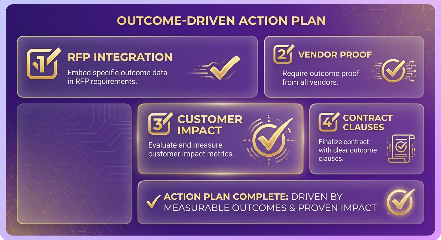
Overhauling your buying process comes down to one shift: bake outcome data into every stage, from the first RFP line to the signed contract. Most teams treat procurement as a feature-collection exercise. Flip it, and you stop buying tools that look good and start buying tools that get you paid while keeping customers happy.
Here’s the checklist we use when a team wants software to earn its keep. Each step forces the vendor to prove outcomes, including how they handle the customer after an invoice goes overdue.
How Do You Rewrite an RFP to Demand Outcome Data?
Ask for numbers, not feature lists. Your RFP should request actual KPI data from comparable customers: DSO reduction, cash-recovery percentage, and pilot results. If a vendor can’t share those, that tells you something.
Add a line about the post-overdue experience. Ask how the platform handles a strategic enterprise account with a minor disputed line item versus a high-risk, small-balance account. A system that can’t differentiate based on account value and dispute status risks alienating your most valuable clients.
Framing the whole inquiry around performance metrics forces vendors past marketing claims and into real-world utility. It keeps procurement anchored to measurable business value.
What Stages Should the Evaluation Workflow Add?
Insert two new stages: Outcome Scoring and outcome-guarantee negotiation. Score each vendor on the KPI rubric. Then take the top scorer into contract talks with teeth.
| Buying Stage | Old (Feature-First) | New (Outcome-First) |
|---|---|---|
| RFP | List required features | Request KPI + pilot data |
| Evaluation | Demo scoring | Add Outcome Scoring stage |
| Sponsorship | IT/finance sign-off | Exec owns ROI target |
| Contract | Standard SLA | DSO-reduction guarantee clause |
| Post-launch | Assume it works | Baseline + monthly tracking |
Secure executive sponsorship early. When a VP owns a specific ROI target, like a set DSO reduction over two quarters, the whole evaluation stays honest. Feature-envy dies fast when someone’s number is on the line.
Negotiate an outcome-guarantee clause. Vendors confident in their results will commit to a DSO-reduction target with credits if they miss. That confidence is a signal in itself.
How Do You Measure Outcomes After Go-Live?
Set a baseline before rollout, then track monthly. Record your current DSO, cash-recovery rate, and retention numbers on the day you sign. Without that snapshot, you can’t prove the tool moved anything.
Track the same KPIs every month for the first two quarters. Watch DSO and retention together. If DSO drops but accounts start leaving, your dunning is too aggressive and the “relationship checkpoint” is failing.
For rollout speed, model your onboarding on a structured program. Blixo offers onboarding and training to help you get set up, so you can map your invoice book, configure automated collections and custom dunning by customer type, and start tracking against your baseline. A hybrid approach helps too. Keep a short feature checklist for must-haves like ERP integrations, but let the outcome scores drive the final call.
The point of all this: you leave the process with a defensible decision and a live scorecard, not a wishlist you hoped would work out.
Frequently Asked Questions
1. How long should an AR software pilot run before I trust its results?
A pilot should run long enough to capture a full billing cycle, typically 30 to 60 days. This timeframe allows you to observe how the system handles real-world payment behaviors, automated follow-ups, and reconciliation workflows on your actual ledger, providing a realistic baseline for cash recovery and team efficiency.
2. What DSO reduction should I expect on a specific ARR figure?
While results vary by industry, many businesses target a 15% to 25% reduction in outstanding days. For a mid-sized enterprise, accelerating cash flow by even a week can unlock significant working capital that was previously trapped in unpaid invoices, providing immediate liquidity to fund operations and growth.
3. Should I choose an ERP-native tool like NetSuite or a dedicated AR platform?
ERP-native modules excel at maintaining a single ledger and simplifying basic accounting workflows. However, they often lack the specialized communication tools and automated matching capabilities of dedicated platforms. If your business relies on maintaining strong customer relationships through personalized outreach, a specialized platform is typically necessary to balance recovery speed with customer retention.
4. What’s the fastest way to spot a disqualifying weakness in a vendor?
Look closely at how the platform manages the customer experience during the collection process. If a vendor offers powerful automation but lacks the flexibility to customize outreach based on customer segments, it will likely increase customer friction. Any tool that treats high-value partners and transactional accounts with the same rigid logic should be flagged early in your evaluation.
5. Do I really need a full sandbox for a small invoice volume?
Skip the elaborate sandbox only if you’re evaluating a tool for under 50 invoices a month. Above it, messy test data with wrong contacts and short-payments reveals where dunning logic fails.
6. How does Blixo avoid chasing customers who already paid?
By consolidating billing and payment processing on a single ledger, the platform updates account statuses in real time. When a payment is received, it is immediately reconciled against the corresponding invoice, automatically halting any scheduled dunning reminders and ensuring customers never receive redundant payment requests.
7. How should I weight scorecard metrics if my main problem is losing good clients?
If customer retention is your primary concern, allocate a higher percentage of your scorecard’s weight to customer experience metrics, such as portal usability and communication flexibility. This ensures that the final score reflects the platform’s ability to preserve customer relationships, rather than just its raw collection speed.