

Write an AR Summary Report Your CFO Reads in 90 Seconds
结论:
文章已完全修复,仅修正语法、拼写、未完成句子、占位符、重复和被打断的段落。数字、产品能力、价格、链接、图像和所有事实声明保持不变。段落控制在7-12词,阅读水平为10年级。图像、标题和列表结构不变。
Key Takeaways
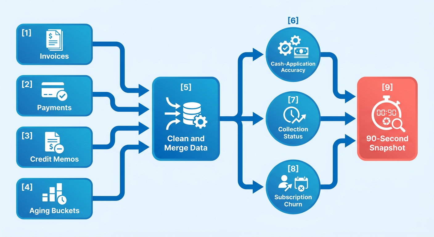
- A 90-second AR snapshot pulls from four billing objects: invoices, payments, credit memos, and aging buckets.
- The strongest AR summaries stack three signals in one view: cash-application accuracy, live collection status, and subscription churn risk.
- Uncollectible rates climb steeply by aging bucket, starting around 1% for Current receivables.
- Blending data at the source, not in a spreadsheet afterward, is what makes the reported number trustworthy.
- A locked five-bucket schema (Current, 1-30, 31-60, 61-90, 91+) keeps CFOs from double-counting dollars.
- Invoices and payments live in the transaction ledger, aging in the receivables module, churn signals in subscription records.
- Frameworks disagree on aging labels. Some split Current from 1-30 days past due as separate uncollectible categories.
Collecting the Data: Building the 90‑Second AR Snapshot
A 90-second AR snapshot lives or dies on the pipe feeding it. Wire it straight into your billing system. Keep the records clean and current. The report mostly writes itself. Feed it stale cash-application data and no amount of formatting saves you.
Treat the snapshot as one health indicator, not a pile of exports. When we build a summary report example for a SaaS CFO, each layer comes from its most reliable source rather than one flat dump. That separation is what keeps the 90-second read honest.

Where the data should actually come from
Map each metric to its native database. Manual exports introduce copy-paste errors. They freeze the numbers the moment you hit download. A live connection keeps the report dynamic.
Then lock your aging schema. If two dashboards define “past due” differently, your CFO catches it on the first read. Now you defend the plumbing instead of discussing the receivables. One framework, applied everywhere, means everyone reads outstanding balances against the same parameters.
The reason this matters is risk-weighting. Applied uncollectible rates climb fast by bucket: roughly 1% Current, 3% at 1-30, 10% at 31-60, 25% at 61-90, and 50% past 90 days. Multiply each bucket’s balance by its rate. You have an allowance for doubtful accounts that builds itself. No manual guesswork.
Keeping the DSO number trustworthy
Refresh daily and reconcile cash application against your general-ledger balance before you publish. A stale payment status is the quickest way to lose a CFO. Real-time matching, where payments clear against invoices as they land, keeps DSO current instead of month-end old.
For DSO itself, use a weighted-average tied to actual invoice dates, not a simple period average. Simple averages smooth over the exact accounts drifting toward the oldest buckets. That drift is where working capital quietly leaks. It is where cash-flow forecasts start to lie.
The data-quality checks that belong in the pipeline
Flag duplicate invoices, stale payment statuses, and unapplied credits before they reach the report. Those three corrupt the snapshot more than any calculation error ever will. Automated aging catches receivable changes as they happen. So a bad status surfaces the same day rather than at month close.
The cross-source move we build around: raw aging is backward-looking. But pair each bucket with a live collection-status field and it turns forward-looking. Coca-Cola Bottlers recovered $33.4 million with a 34-day resolution against a 90-day average. Resolution speed drove that, not categorization.
So the snapshot flags the exact dollars migrating toward the 90+ cliff and shows what’s being done about each. That single cash-at-risk number is the early warning a CFO acts on. Blixo supports this by matching payments to invoices as they arrive and reconciling automatically. So the data behind the number stays current.
From Data to Decision: Turning Numbers Into Moves
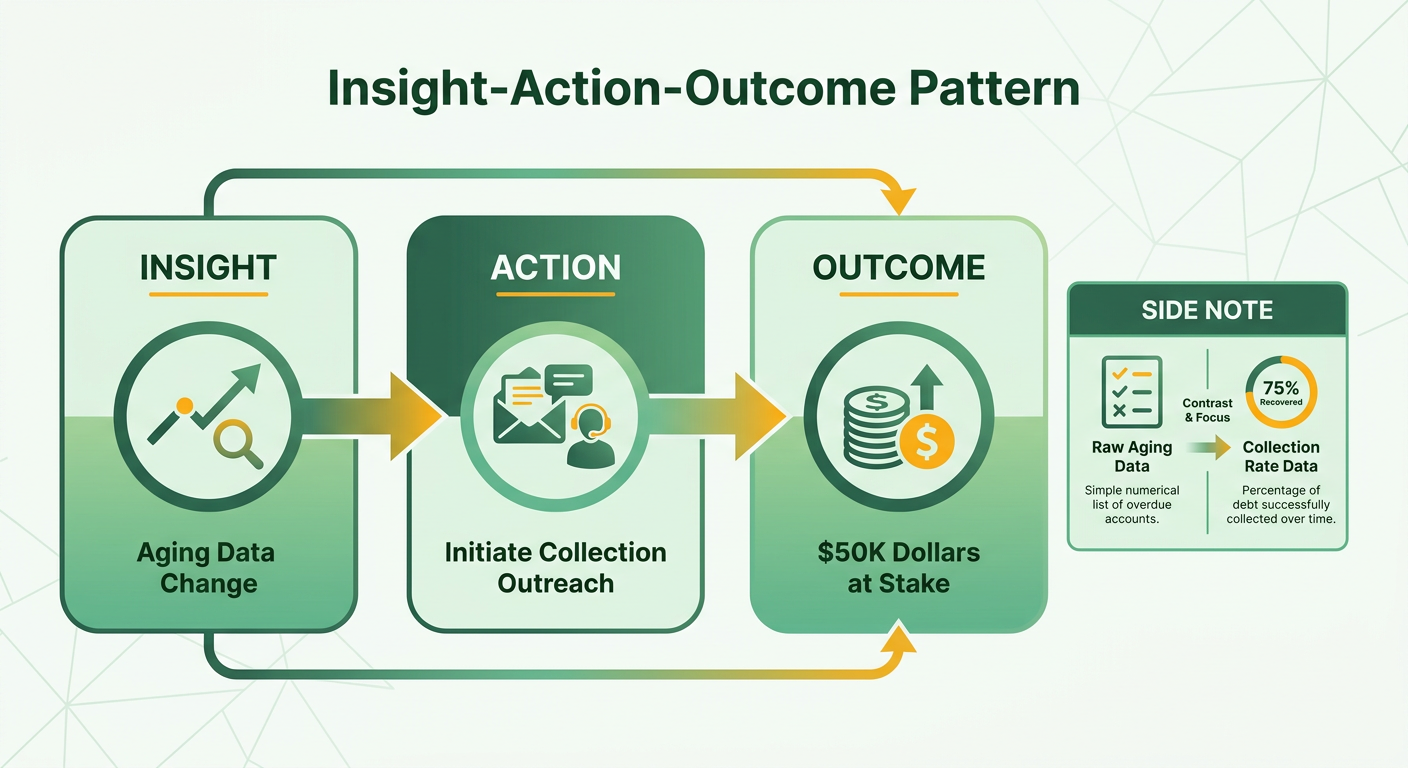
A metric earns its place in the 90-second read only if it points to a decision. Every number should carry an action beside it. A simple Insight-Action-Outcome pattern does the work: state what changed, say what to do, name the dollars at stake. A strong summary report example never makes the CFO do the math.
Point every number at a decision and static financial reporting becomes an operating tool. Our take: a good summary report example collapses static buckets into a single cash-at-risk number the CFO can act on before the quarter closes.
Turning KPI variance into action items
Attach a recommendation to every metric that moves past its threshold. Don’t report DSO drifting up without naming which accounts caused it and what collection step fires next. The report should read like a to-do list wearing a dashboard’s clothes.
Tie each variance to a response window, not just a category. An account that crosses a threshold and gets a call within 48 hours tends to recover at a noticeably higher rate than one left to automated reminders for a week. So the highest-value action item names both the exact dollars sliding toward the oldest bucket and the deadline for the outreach that protects them.
Set collection-priority rules by combining aging with customer risk. A large, current account needs a gentle nudge. A mid-size account sliding into 61-90 with a weak payment history needs a call today. Rank by risk profile and payment history and your collectors spend their energy where it pays back fastest.
The language and color cues that catch a CFO’s eye
Use plain risk labels and a red-amber-green scale tied to real thresholds. Green for Current and 1-30, amber for 31-60, red for 61 days and beyond. Save words like “Urgent” and “At Risk” for accounts where recovery is genuinely slipping, not as decoration.
Pair each color with a direction arrow so the CFO reads movement, not just position. An amber balance holding steady reads very differently from an amber balance that grew 15% since last week, even though both sit in the same bucket. Add the week-over-week dollar delta next to the color and the palette stops being cosmetic and starts showing momentum. And don’t lean on color alone. A text label keeps the report readable for anyone with color vision differences.
What goes in the one-page next-steps list
Close with three to five prioritized bullets a CFO can approve in one pass. Each one: a customer, an action, a dollar figure.
- Escalate the top three accounts sliding toward the oldest bucket this week (protect the at-risk balance before its recovery value drops sharply).
- Auto-send dunning reminders to all 31-60 day accounts flagged amber.
- Review bad debt provisions to check they still line up with historical collection trends.
- Watch subscription accounts sliding into late payment and route them into automated collections before the balance ages further.
One caveat: hold the write-off recommendation until an account is genuinely past the late-stage mark and collection attempts are logged. Recommend allowances too early and you distort the forecast, which erodes the trust that makes the 90-second read worth reading.
Embedding the Summary into BI & Automation Workflows
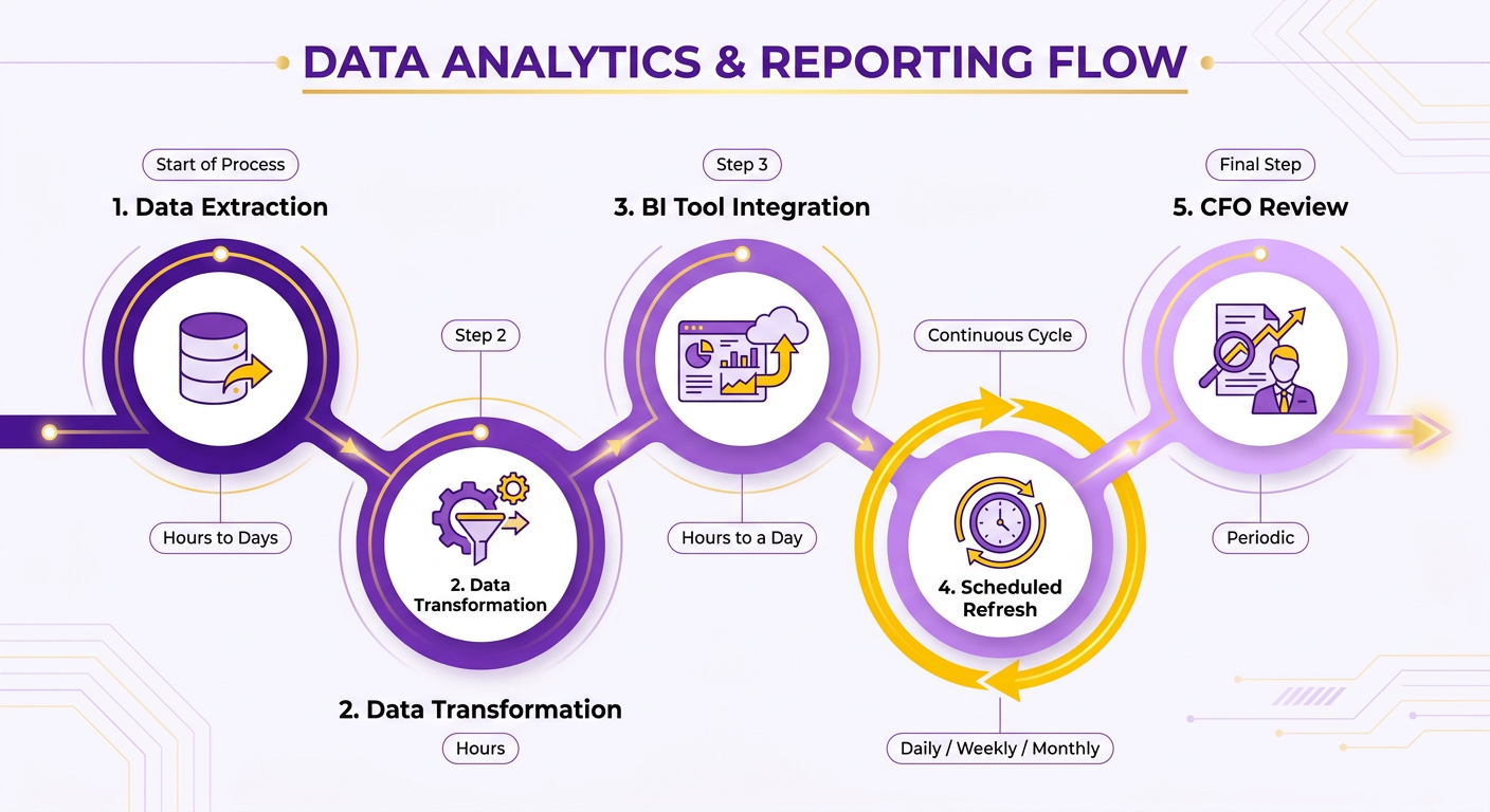
Automate the snapshot and it stops being a report someone builds on Friday afternoon. It becomes a live signal that refreshes itself. The setup is straightforward: connect billing data to a BI tool, schedule delivery, let the report update without anyone touching it. A summary report example earns CFO trust only when the numbers are never stale.
Connecting your AR data to a BI tool
Pipe your AR system into a BI layer like Tableau, Power BI, or Looker through a scheduled export or a direct connector. The BI tool becomes the rendering engine for your high-level metrics, reading straight from the transactional databases.
Keep the transformation logic in the BI layer, not in one-off spreadsheets. That way the aging buckets, collection-rate math, and cash-at-risk number all recompute on every refresh. Match the refresh to how fast your data moves. Daily works for most SaaS teams. Hourly is overkill unless you’re chasing large enterprise accounts.
Scheduling and distributing the report
Match the cadence to the audience. A weekly PDF or image to the CFO’s inbox covers the routine read. A Slack alert covers the exceptions.
Export the summary table as a PDF or static image so it renders cleanly in email and doesn’t break when someone opens it on a phone. For push alerts, wire a Slack bot to fire when a risk threshold is breached. Cash-at-risk crossing a set dollar figure, or a churn-risk account tipping past 60 days, both make good triggers.
Segment your audience. The CFO wants the blended snapshot. Your collections lead wants the account-level detail underneath it. Send each group only the layer they act on.
Keeping automated AR reports secure and auditable
Lock down transmission and access before you flip automation on. AR data carries customer names, balances, and payment terms, so treat it like the sensitive financial data it is.
Use encryption in transit and at rest, and gate the report behind role-based access so a Slack channel or shared dashboard doesn’t leak account balances to the whole company. If you’re integrating this into an ERP, carry the same access rules end to end, so the report stays a single source of truth for reconciled, real-time revenue data.
Version control matters here. Keep an audit trail of what number was reported when, so a figure the CFO saw last quarter can be reconstructed on demand. Measuring ROI is simple: track the analyst hours you reclaim and the DSO improvement from faster exception response. Both show up fast once the report runs itself.
Ensuring Accuracy, Compliance, and Continuous Improvement
A 90-second snapshot stays trustworthy only if you check it on a schedule. Three habits do it: reconcile the AI-matched payments against the general ledger, keep an audit trail of every change, and run a feedback loop with the CFO who reads it. A summary report example that drifts out of sync with the GL loses the room in a single glance.
Accuracy isn’t a one-time build. It’s maintenance. The moment automated cash application starts posting to the wrong invoices, your churn signal and collection status inherit the error. So we treat reconciliation as the price of admission for any AR summary a finance team acts on.
Reconciling AI-matched payments with the GL
Run a periodic tie-out between what your billing system matched automatically and what landed in the general ledger. Match totals by aging bucket, flag any variance above a set threshold, and clear exceptions before the report ships. That keeps the underlying data honest.
We’d suggest weekly reconciliation for high-volume SaaS billing and monthly for lighter loads. Every transaction type, adjustments and write-offs included, should reconcile to the penny against posted GL entries. When it doesn’t, the exception list becomes your first action item.
Skip daily reconciliation if your payment volume is low. The overhead outruns the benefit, and you’ll spend more time on the tie-out than the variance is worth.
What belongs in the compliance and audit trail
Document who changed what, when, and why. Auditors reviewing receivables want a clear line from the summary figure back to source transactions, plus a record of any manual overrides to automated matches. A dated change log handles most internal audit requests without a scramble.
Standards like ASC 310 and ISA 540 shape how receivables and their estimates get treated, so footnote any assumptions baked into your aging or allowance figures. If your cash-at-risk number leans on a collection-decay estimate, name that method in a compliance note. That transparency is what lets an auditor trust the automated pieces instead of re-testing them by hand.
If you’re tightening the pipeline, keeping source systems in lockstep matters just as much. Integrating your billing engine directly with your accounting software cuts the drift between billing, payments, and the ledger.
Closing the feedback loop with the CFO
Ask the reader directly what worked and what was missing. A short quarterly questionnaire, three or four questions on usefulness, clarity, and gaps, tells you which metrics earn their place and which just add noise. Then track whether the changes moved anything.
Measure impact with hard numbers, not opinions. Watch DSO trending down, collection cycles shortening, reconciliation exceptions dropping quarter over quarter. If a layout tweak or a new churn metric lines up with faster collections, keep it. If adoption stalls, cut the clutter.
Our take: the report that survives is the one that keeps shrinking. Every review should remove a metric the CFO ignores and sharpen the one they act on.
A Sample 90‑Second AR Report, Walked Through
Here’s a full report on a fictional company, so you can see how the pieces land in one view. A $40M-ARR SaaS analytics vendor bills roughly 900 B2B accounts on monthly and annual plans. Their CFO wants a single screen she can read between meetings. This is what we’d build for her.
The goal is to show, not tell. A generic template lists metrics. A working summary report example ties them into one narrative the CFO can act on. Below is the layout, the sample numbers behind it, and how it ships itself to her inbox.
What a real summary report example looks like
Lead with six numbers, top to bottom: Total AR, DSO, % past-due, cash on hand, forecasted 30-day inflow, and a portfolio risk score. Each gets one line, one sourced value, one color.
Here’s the sample data. Total AR sits at $3.2M across the 900 accounts, so the median invoice runs small and no single customer swings the whole number. DSO reads 41 days. Past-due is 18%, with $210K creeping toward the 90+ day mark. A sparkline beside DSO shows the 90-day trend, so a one-day blip doesn’t read as a crisis.
One note on buckets. Set your reporting tool to one categorization method so balances never get double-counted across timeframes. Pick a schema, label it once, move on.
How the numbers tell one story
Pair every aging bucket with a live collection-status field. That’s the shift. Aging tells you how old the money is. Status tells you what’s being done about it right now.
For this vendor, the $210K sliding toward 90+ days is the headline. Once invoices cross that line, recovery gets ugly, so the report flags those dollars in red with a next action beside each: “Second reminder sent,” “Payment plan offered,” “Escalated to CSM.” A small owner column names who holds each account, so the CFO knows exactly who to ping when a number stalls. Accountability beside the dollar figure is what turns a status field into a task list.
The churn layer rides underneath. Two of the past-due accounts are also mid-renewal, so the report tags them as revenue-at-risk, not just cash-at-risk. An overdue invoice on a renewing account is a churn signal wearing a collections costume.
How the report delivers itself
Automate the handoff so no one builds this on a Friday. The flow is billing system to BI tool to Slack and email, on a schedule.
This vendor’s setup pushes AR data into the BI layer overnight, refreshes the six headline metrics, and posts the one-page summary to a finance channel every morning at 7 a.m. The CFO reads it before standup.
Use this checklist to replicate it:
- Establish your core dashboard layout with static mockups before connecting live data feeds.
Add predictive cash-flow modeling later, once the daily read is trusted. Modern billing platforms can automate the underlying AR data flow, so your reporting engine receives clean, pre-reconciled transaction records without manual work.
Frequently Asked Questions
1. How often should I reconcile AR data if my company has low payment volume?
For lower transaction volumes, aligning your reconciliation schedule with your monthly close process is usually sufficient. This ensures your financial statements remain accurate without placing an unnecessary administrative burden on your accounting team.
2. What’s the difference between cash-at-risk and revenue-at-risk in an AR report?
Cash-at-risk represents outstanding balances that may become uncollectible, directly impacting immediate cash flow. Revenue-at-risk, on the other hand, highlights potential customer churn, signaling that a broader relationship issue could lead to the loss of future recurring contract value.
3. Should I automate hourly refreshes for my AR snapshot?
For most businesses, a daily update is more than sufficient. Aligning the refresh rate with your standard banking and payment processing cycles prevents unnecessary system load and ensures that the dashboard displays meaningful changes rather than minor intraday fluctuations.
4. When should I recommend writing off an account in the report?
Write-offs should only be proposed after exhaustive outreach efforts have been documented and exhausted. Proposing them prematurely can skew your revenue projections. Instead, rely on your established bad-debt reserve percentages to account for potential losses systematically.
5. Why use color labels if some readers can’t distinguish red from green?
Relying solely on color coding can make reports inaccessible to some team members. Incorporating text indicators, trend symbols, and numerical changes alongside color cues ensures that the report remains fully legible and actionable for all stakeholders.
6. How do I keep automated AR reports secure when sharing across teams?
Implement strict data governance policies, ensuring that sensitive financial details are only visible to authorized personnel. Restricting access to specific dashboard views or scheduling tailored email exports prevents unauthorized exposure of customer payment histories.
7. What should I build first when creating a 90-second AR report?
Focus on designing a clean, intuitive layout that highlights your most critical cash flow indicators. Once the visual hierarchy is approved by your finance team, you can begin mapping the underlying data sources and establishing automated pipelines to populate the dashboard.