

Turn Raw Aging Data into a One-Page Collections Summary Report

Key Takeaways
- Late payments account for 49% of B2B sales, and collections run about 73 days from invoice to payment.
- Once an invoice passes 90 days, there’s only an 18% chance you’ll ever collect it. Those are your least recoverable balances.
- Between 60% and 70% of B2B firms still run on manual aging reports — an approach the data keeps punishing.
- Cash flow problems drive 82% of company failures, per Jessie Hagen’s research at U.S. Bank.
- A one-page collections summary compresses scattered data into a single screen you can act on. A raw ledger just records history.
- 81% of finance leaders say collecting open invoices got harder, and 69% report more late payments over the past year.
- Roughly 74% of finance teams burn real hours every week chasing overdue accounts, rebuilding the same fragmented view again and again.
Why a one-page summary beats a raw aging ledger
A raw aging ledger tells you what happened. A one-page collections summary tells you what to do next. That gap is where cash gets recovered.
Most finance teams still work off spreadsheets, which pulls accounting records away from treasury. Static, manual reports leave collectors staring backward at historical balances instead of managing current risk. When cash flow runs on outdated ledgers, keeping enough liquidity for daily operations gets harder than it should be.
A clean summary does more than list overdue invoices. It compresses fragmented data, removes the manual math, and gives collectors one screen to work from. In our experience, that single page separates blind chasing from focused action.
Why do manual aging reports fail finance teams?
They’re stale, scattered, and slow. Data lives in your accounting system, your bank feed, and three spreadsheets nobody trusts. By the time you reconcile it, the picture has already changed.
The pain shows up as administrative friction. AR teams burn hours every week compiling data from disconnected systems, only to produce a report that’s obsolete before it prints. That overhead pulls skilled finance people away from credit analysis and customer relationships, and turns them into expensive data-entry clerks.
There’s also a trap nobody names: teams read aging reports backward. They instinctively chase the oldest, largest balances first. But recovery odds drop sharply once an invoice crosses the three-month mark. Pour most of your effort into those stale balances and you get diminishing returns, while fresher, far more recoverable accounts quietly rot in the background.
Which accounts should you actually chase first?
Chase the 30-to-60 day bucket first, not the oldest one. Payments in that window are the most recoverable, since they haven’t drifted toward bad debt yet. Risk and recoverability should drive priority, not raw age.
Our take: a good summary weights the 30-60 day window highest and scores each account by churn risk, which inverts how traditional tools push aged totals to the top. That’s the thinking behind Blixo’s automated collections and aging reports, which pair reminders across email, text, phone, and letter with churn prediction so collectors spend effort where it actually recovers cash.
How does a one-page summary feed cash-flow forecasting?
It becomes a forecast when you overlay subscription renewal dates and churn risk onto the aging buckets. That turns a backward-looking ledger into a real-time cash projection.
This solves a specific problem. 79% of finance leaders lose confidence in cash-flow forecasts beyond 60 days, and in manufacturing that climbs to 86%. Aged receivables just aren’t reliable that far out. Renewals are. They’re contractual and predictable, so layering them over your aging data replaces guesswork with revenue you can count on. Understanding churn through segmentation sharpens which of those renewals are genuinely at risk.
This matters most for SaaS with recurring billing, professional services, and B2B firms pushing high invoice volume. Automating the report closes the loop: 63% of finance leaders say automation has already cut payment delays, and 91% expect to trim four or more days off their DSO within a year. For a mid-size firm, standing up an automated one-page dashboard is a two-to-three week project, not a quarter-long build.
Validate, clean, and structure the extracted records
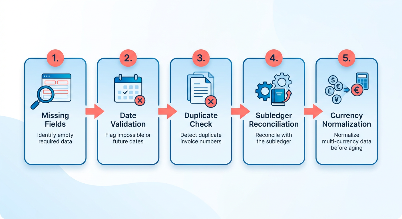
Raw extracted data lies to you until it’s validated. Before any aging calculation runs, catch the missing fields, impossible dates, and duplicate invoice numbers. Skip this and your one-page forecast inherits every error hiding in the source file.
One step most teams skip: aging data has to be reconciled against the subledger before you trust it for forecasting. Business Central’s aged receivables export splits into separate worksheets for subledger reconciliation, multi-currency handling, and aging detail for exactly that reason. The extract-and-clean step isn’t cosmetic. It’s what makes any downstream cash number credible.
What belongs on your data-quality checklist?
A data-quality checklist is one pass over the extracted records to flag anything that would corrupt the aging math before it hits your summary.
Run these on every batch:
- Missing fields: no due date, no amount, or no invoice number. Any one of these breaks bucket assignment.
- Impossible dates: due dates before issue dates, or dates in the far future. These skew days-past-due instantly.
- Duplicate invoice numbers: the same invoice counted twice inflates both your overdue total and your forecast.
- Out-of-range amounts: negative or absurdly large values that signal a parsing error.
For de-duplication, fuzzy matching on invoice number and amount catches near-duplicates that exact matching misses. Excel Power Query and Python pandas both handle it. A scanned “INV-1042” and a CSV “INV 1042” are the same invoice; only fuzzy logic pairs them.
How do you normalize dates and currency?
Normalization converts messy inputs into one consistent format so aging buckets stay accurate. Convert every date to ISO 8601 (YYYY-MM-DD) and resolve time zones before running days-past-due. A global client’s invoice dated “03/04” is ambiguous until you pin the format and zone.
The bucket structure this feeds is standard: current, 30 days, 60 days, and 90+ days overdue. That’s the grouping most aging reports use, and it’s what your summary rolls up into.
For multi-currency firms, apply daily FX rates through a lookup table keyed to invoice date. Convert to your reporting currency at each invoice’s issue date, not today’s rate. Otherwise your total AR shifts every time the market moves, and the forecast turns to noise.
Where Excel stops and automation starts
Excel builds a working aging schedule. The Journal of Accountancy shows a dynamic example using =TODAY-[Due Date] for days past due and nested IF statements for bucket assignment. For small volumes or a one-off, that’s genuinely enough.
But there’s a ceiling. Manual Excel upkeep gets error-prone at scale, and teams that move to automated AR tend to gain accuracy and reclaim maintenance time. Both approaches have a place. Excel is a fine starting point; it breaks once you need weekly refreshes across hundreds of invoices. That’s where a platform like Blixo helps. Its matching engine ties payments to invoices with high accuracy, and gets smarter over time through machine learning as you make manual edits.
A live aging view beats a static monthly PDF because it captures signal changes as they happen, so the summary has to be a live artifact, not a stale snapshot. Validation rules that auto-reject malformed invoices at intake, plus an audit trail logging the original file name, extraction timestamp, and every manual edit, keep that live view trustworthy. Color-code out-of-range cells so errors surface before they reach the forecast, not after.
Automate aging calculations and apply bucket logic
Days outstanding is one formula: =TODAY-[Invoice Date]. That single subtraction feeds every bucket, every total, and every forecast downstream. Get it right and the rest of your summary builds itself.
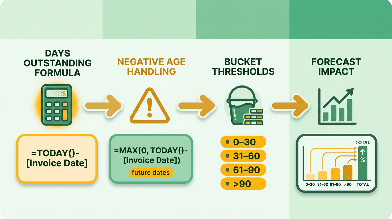
Here’s the catch. Invoice dates can land in the future when someone fat-fingers an entry, which produces a negative age. Wrap the calculation to catch it: =MAX(0, TODAY-[Invoice Date]). If you bill against due dates rather than invoice dates, swap in [Due Date] so a 30-day term doesn’t show as overdue on day one.
How do you assign each invoice to a bucket?
Assign buckets in a single column with IFS or SWITCH instead of nesting IF five levels deep. The standard brackets are 0-30, 31-60, 61-90, and 90+ days — the same intervals QuickBooks and NetSuite use out of the box.
Here’s the pattern:
=IFS(
 [Days]<=30, "0-30",
 [Days]<=60, "31-60",
 [Days]<=90, "61-90",
 TRUE, "90+"
)
Don’t hard-code the thresholds. Point them at named ranges (Bucket1, Bucket2) so when your industry runs net-45 terms, you shift one cell and the whole schedule re-buckets. Service businesses with retainer clients often need a 0-45 first bucket. Usage-based SaaS might want tighter 0-15 windows to catch churn signals early.
What belongs in the pivot summary?
Build a pivot table with three measures per bucket: total amount, invoice count, and average age. That’s your one-page view. Bucket totals across the top, a grand total for outstanding AR, and average days delinquent per column.
To make the pivot actionable, structure the fields to surface concentration risk. Put customer names in the rows and aging buckets in the columns. Then add a calculated field that shows each bucket’s total as a percentage of overall outstanding AR, not just raw dollars. That immediately reveals if a single client or a specific bracket is tying up a disproportionate share of your working capital.
Should you automate or stay in Excel?
Spreadsheets are highly customizable, but they struggle with scale and collaboration. Once multiple people need to access, update, and review the same schedule, version-control problems creep in. Large datasets with thousands of rows also cause calculation lag that slows the whole finance team down.
Reconciling manual entries across multiple billing systems carries real risk. Research shows spreadsheet-based financial models carry errors in roughly 88% of cases. When aging schedules are built by hand, a simple copy-paste slip or a broken cell reference can quietly distort your cash projections, and you end up making strategic calls on flawed numbers.
Performance tip: keep the math in the data layer, not in volatile sheet formulas. Business Central’s aged receivables export runs its calculations through Power Query for that reason. The numbers recompute once on refresh instead of on every keystroke.
Blixo’s aging reports and automated reminders smooth this transition. Beyond the calculations, the platform automates cash application by matching incoming payments to open invoices in real time. So your collections team is never chasing a client who already paid, which preserves the relationship and clears the daily reconciliation bottleneck.
Design and build the one-page dashboard
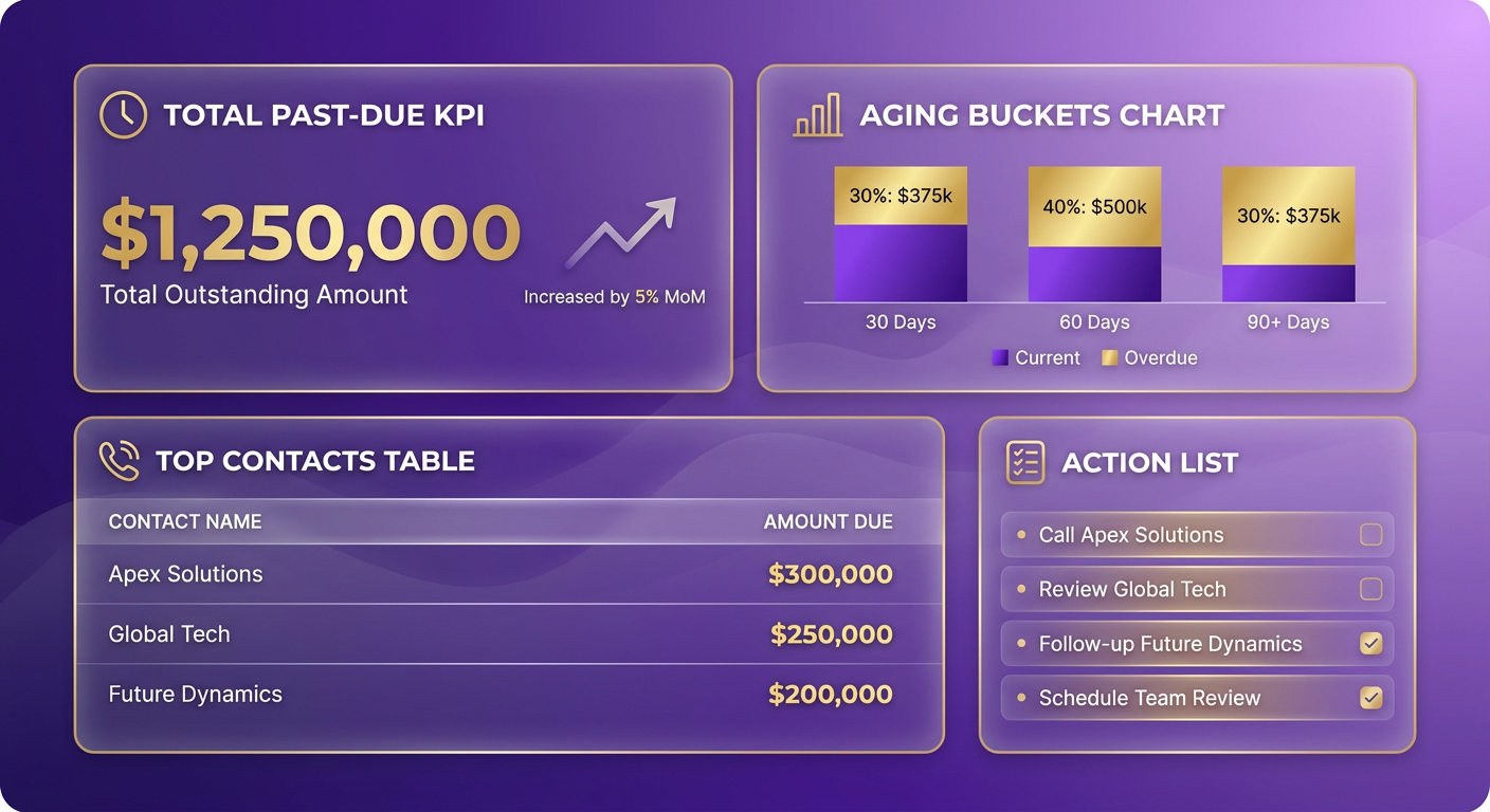
A one-page collections summary works when a collector can act on it in under ten seconds. One screen, one visual hierarchy, no scrolling. The layout should answer three questions in order: how much is past due, where is it concentrated, and who do I call first.
A strong summary opens with a single headline KPI at the top: Total Past-Due, in the largest type on the page. Below it, a stacked bar chart splits that total into aging buckets. Under the chart, a ranked list of your top-five overdue customers with an action column. Everything else is secondary.
What layout hierarchy actually works?
The hierarchy should mirror how a collector makes a decision, from total exposure down to the specific call.
Lead with Total Past-Due as the hero number. Directly under it, a stacked bar showing the 0-30, 31-60, 61-90, and 90+ day buckets side by side. Same interval structure finance teams already know, so nobody has to relearn the view.
Add a 12-month DSO sparkline beside the headline. One thin line tells you whether collections are trending up or down. That trend is what turns a static number into a signal.
Below the distribution, list the top-five overdue customers ranked by total outstanding balance. For each account, include the fields a collector needs to dial immediately: primary billing contact, direct phone number, date of last contact, and a “promised payment date” field. No digging through sub-menus before a call.
Which charts and formatting rules earn their space?
Use a stacked bar for bucket distribution and a sparkline for the DSO trend. Skip pie charts. They force the eye to compare wedges, which is slower than reading bars off a shared baseline.
Conditional formatting does the triage for you:
- Red for anything in the 90+ day bucket.
- Green for current, 0-30 day balances.
- Data bars in the amount column so the largest exposures pop without reading a single digit.
Keep filters without breaking the one-page rule. Slicers for region, product line, or sales rep sit in a slim top ribbon. They refilter the same page instead of spawning a second view.
One note on accessibility: color alone should never carry meaning. Pair red and green with a text label or icon, keep contrast high for print, and add alt-text to every chart. A collector printing to PDF for a credit committee needs the same clarity as the on-screen version.
How do you make it live, not static?
A live dashboard has to serve different stakeholders. A collector needs invoice-level detail; a CFO wants high-level trends. Role-based access lets executive leadership see the macro cash-flow impact while the ops team drills into individual customer histories, all on the same live interface.
To hold that live state, the dashboard should connect directly to your core ERP and CRM through real-time APIs. When a sales rep logs a dispute or a customer updates their payment method, the change should reflect on the summary right away. That cross-department visibility prevents double-outreach and keeps sales and finance aligned.
Export both ways: a branded printable PDF for the boardroom, and a live view for daily standups.
Deploy it, wire it to your collection workflow, and keep the data honest
A one-page summary means nothing if it sits in a folder nobody opens. Deployment is where most collections dashboards die. The report has to refresh on its own, land where your reps already work, and stay accurate long after the person who built it moves on.
The urgency is concrete: the average company writes off roughly 1.5% of receivables as bad debt each year. To stop that leakage, the summary has to be built into daily standups and operational workflows. Moving it from a passive report to an active workflow driver is what gets overdue balances handled before they turn into write-offs.
How do you automate the refresh and distribution?
Set the data pipeline to refresh nightly during off-peak hours to avoid system latency. On a modern collections platform, that sync happens automatically through native ledger integrations. For teams still on spreadsheets, a scheduled script or cloud automation flow can pull the latest subledger data, run the validation checks, and rebuild the summary before anyone logs in.
Then push the output to where people actually work. Three distribution channels tend to work best:
- Email the PDF summary to the collections team each morning.
- Push a Slack alert with the top-five overdue accounts and total past-due.
- Embed the live view in your CRM so account owners see it beside customer records.
Automating distribution also simplifies external reporting. Lenders, board members, and audit committees regularly want updates on AR health. A system that packages the one-page summary into a secure, password-protected PDF and emails it to stakeholders on the first of the month wipes out hours of manual prep.
How do you link the report to real action?
Auto-generate a task list from the buckets. When an account crosses into 90+ days, the system should create a follow-up task assigned to the right AR rep, with no manual triage.
Set clear escalation paths off those triggers. An account entering a new overdue bracket can move automatically from email reminders to a scheduled phone-call task for an account manager. If the balance stays unpaid, the file can escalate to senior management for credit-hold approval.
Our take: build the alert logic around systemic risk. Fire an immediate notification to the CFO when total past-due crosses 5% of ARR. At that threshold, the system can flag high-risk accounts for temporary credit holds or service suspensions, so you stop compounding exposure on accounts that aren’t paying.
What keeps the data trustworthy over time?
Governance is a person, not a policy document. Assign one data owner who signs off on the pipeline, keeps a change-log for every formula edit, and runs a quarterly data-quality audit against the subledger.
Track three numbers before and after you deploy: DSO, collection rate, and time-to-close. If DSO drops and collection rate climbs, the summary is doing its job. If the numbers don’t move, your alerts are firing into the void.
As you scale, keep historical benchmarks so you can read seasonal collection trends. Archiving closed invoice data into a data warehouse keeps your active reporting database fast while preserving the records you need for year-over-year comparisons.
Frequently Asked Questions
1. What DSO improvement can I realistically expect after automating my aging reports?
Most businesses see a measurable drop in Days Sales Outstanding (DSO) by eliminating the lag between invoice generation and customer receipt. Automation ensures invoices are sent instantly, follow-ups are systematically triggered on the due date, and customers are provided with direct, self-service payment links. This frictionless payment experience directly accelerates cash inflows.
2. Why should I chase 30-to-60 day accounts before older overdue invoices?
Debtors are far more responsive when the transaction is fresh in their minds. In the 30-to-60 day window, any disputes regarding delivery or service quality can be resolved quickly because the details are recent. Once an invoice ages past 90 days, client contacts may have changed, documentation is harder to retrieve, and the debtor has likely prioritized other, newer vendors.
3. Can I build a one-page collections summary in Excel, or do I need dedicated software?
You can certainly start in Excel using basic date formulas and pivot tables to summarize your accounts. However, the primary limitation is maintenance overhead. Excel requires manual data exports, manual reconciliation of payments, and constant troubleshooting of broken formulas. Dedicated software automates these data pipelines, ensuring your summary is always accurate and up-to-date without manual intervention.
4. How do I handle invoices dated in the future that show negative aging?
Future-dated invoices often stem from pre-billing agreements or simple data-entry mistakes. To handle them systematically, configure your reporting logic to exclude any transaction where the issue date is greater than the current system date. Alternatively, establish an automated validation rule in your ERP that flags future-dated entries for management approval before they are posted to the subledger.
5. How does adding subscription renewal dates improve my cash-flow forecast?
Integrating renewal dates allows you to calculate a “net cash collection” forecast. While aging reports show what cash is overdue and potentially delayed, renewal schedules show guaranteed upcoming billings. Combining these two datasets helps finance teams project cash inflows more accurately, balancing potential write-offs against contracted future revenue.
6. What data-quality checks should run before I trust aging numbers?
Before running any aging calculations, implement an automated data-cleansing step. This process should programmatically scan your raw data for structural anomalies, such as blank fields in critical columns or mismatched currency codes. By setting up automated validation gates, you ensure that corrupt or incomplete records are quarantined for review before they can skew your summary metrics.
7. How do I make a collections summary accessible for print and color-blind users?
Design your dashboard using high-contrast palettes and distinct visual patterns rather than relying solely on color coding. For example, use cross-hatching or dotted fills to differentiate aging buckets in bar charts. Additionally, ensure all charts include clear text labels and structured data tables below them, allowing screen readers and printed monochrome reports to convey the exact same insights.