

Executive Summary Reports Go Stale the Moment Collections Chase a Customer

Key Takeaways
- Executive summary reports on collections go stale within 6 to 24 hours.
- CFOs then steer cash decisions from an already outdated picture.
- Manual revenue reporting eats 20 to 40 hours a month.
- Mid-stage SaaS finance teams often repeat five to ten reports.
- Late B2B payments keep rising, widening the reporting gap.
- Automated summaries update continuously, unlike static weekly or monthly refreshes.
- About 73% of analysts call manual reporting a major time sink.
- Static summaries make collections reactive, not proactive.
- Live feeds from collection workflows surface risk as it appears.
- The fix is a live report, not a prettier one.
- Automation lands at medium implementation difficulty, not high.
The One-Sentence Problem
An executive summary report on collections is outdated before you finish reading it. Manual revenue reporting for a mid-stage SaaS company burns 20 to 40 hours a month, and by the time those reports land, the data is already 6 to 24 hours stale. In that same window, late B2B payments keep climbing. So the CFO is steering cash-flow decisions on a picture that’s already changed.
That lag is the whole game. You approve a hiring plan or vendor payment against a receivables snapshot that no longer reflects who paid, who slipped, or which account just went high-risk. The fix isn’t a prettier report. It’s a live one.
Static Summary vs. Automated: What Each One Costs You
Static executive summary: a point-in-time document, refreshed by hand, describing cash risk as it looked hours or days ago. Automated summary: a live view that updates as payments and collection actions happen, so the number you see is the number that’s true right now.
Side by side:
| Dimension | Traditional static summary | Dynamic, automated summary |
|---|---|---|
| Update frequency | Weekly or monthly | Continuous, real-time |
| Data staleness | 6–24 hours, often more | Near-zero |
| Effort to produce | 2–4 hours each, 5–10 reports/month | Runs automatically |
| Data sources | Manually pulled, siloed | Live feed from collection workflows |
| Impact on collections | Reactive; you learn late | Proactive; act as risk appears |
| Difficulty to implement | Low, it’s the default | Medium |
The effort numbers stack up fast. A mid-stage SaaS team produces five to ten recurring reports, each taking two to four hours. That’s your 20-to-40-hour drain, and 73% of analysts call manual reporting their single biggest time sink.
Which Metrics the Summary Should Actually Show
Every collections summary a CFO reads should surface total past-due balance, days sales outstanding (DSO), high-risk accounts, and collection-stage distribution. Those four answer the only question that matters at the executive level: how much cash is at risk, and how close is it to walking out the door?
Companies that automated accounts receivable reported real DSO reduction and stronger cash flow. Automated dashboards let teams pull these KPIs in real time and adjust strategy on the spot instead of waiting for an end-of-day review.
One warning worth flagging early: don’t build a single summary that tries to serve everyone. As a revenue operations leader at a $50M ARR SaaS company put it:
“It is building one report that tries to serve every audience and ends up serving none of them well.”
Our take: the CFO wants the aggregate cash-risk pattern. The collector wants the named account and the script. Pull both from one live source, then split the views. That’s the difference between a summary that ages and one that keeps pace with the chase.
Why Fresh Summaries Matter When You’re Mid-Chase
A stale executive summary during an active chase is worse than no report at all. It hands decision-makers false confidence in numbers that no longer match reality. Your collectors are on the phone chasing an account, and the aggregate cash picture your CFO is reading has already shifted underneath both of them.
That gap is the problem in a nutshell. The average small US business carries roughly $84,000 in unpaid invoices at any given time, and most late payments trace back to customer cash-flow constraints rather than disputes or errors. Every hour those chases run, the summary on the CFO’s desk drifts further from the truth.
Why a Stale Summary Actively Misleads
Decision lag is the time between new payment information arriving and executives becoming aware of it. In a manual setup, compiling those updates means pulling data from disconnected systems. So by the time the spreadsheet is formatted and emailed, the underlying balances have already changed.
That’s the disconnect. By the time a CFO opens the summary, a customer flagged as “paying” may have already broken their promise, while another marked “high-risk” might have cleared the balance. Approving vendor payments or adjusting hiring against that snapshot means operating on history, not current liquidity.
When macro pressure squeezes customer cash, the delays compound. A lagging report hides a deteriorating position at the exact moment leadership needs to tighten credit terms or accelerate outreach.
One Report Can’t Serve Both the CFO and the Collector
A common mistake: forcing one document to satisfy everyone. When a collections team runs off a single unified spreadsheet, the high-level trends get buried under transaction logs, and the collectors lose the specific context they need for daily outreach.
Leadership wants macro insight: portfolio-wide exposure, aging trends, segment-specific deterioration. The collections manager needs tactical execution data: a prioritized worklist of who to call next, their payment history, and communication logs. For subscription models, that tactical view also has to flag recurring revenue exposure to catch silent churn.
Instead of maintaining separate, conflicting documents, modern systems generate distinct views from a single, unified data layer. The trends reviewed in the board meeting line up with the tasks assigned to the collections desk.
The Cost of Waiting
The cost of delay is measurable. With most finance departments still on manual workflows, most teams carry a structural delay by default. Wiring automation into the receivables process correlates with lower write-offs and more predictable working capital.
Real-time dashboards close the decision lag by updating metrics as payments and interactions happen, not at end-of-day review. For a SaaS CFO guarding cash, that shift from stale summary to live view is where the money actually gets recovered. If you want to dig into how reconciliation quality feeds report accuracy, your summary report is only as accurate as the cash you’ve reconciled.
Anatomy of a Summary That Actually Gets Read
A good collections summary answers one question fast: who do we chase next, and why? It packs the highest-risk accounts, the aging picture, and the cash at stake into a view a CFO can absorb in under a minute. The best ones fit on a single screen and cut everything that doesn’t change a decision today.
The way you get there is a clear visual hierarchy. Put portfolio-health metrics at the top, and let users drill into specific account segments without cluttering the primary view. 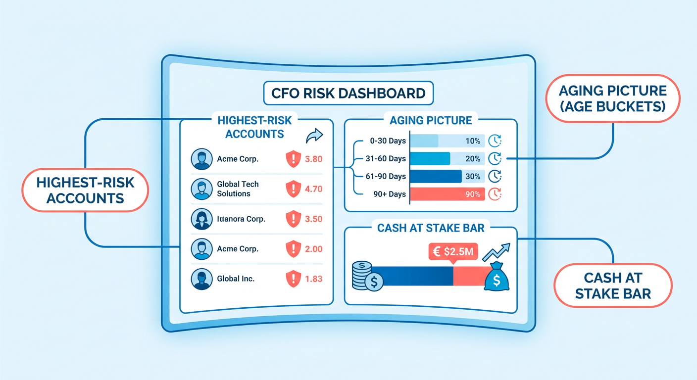
What Data Points Belong in a Collections Summary
The non-negotiable fields are the ones that name a target and rank it. At minimum, your chase-next view needs five columns: Customer Name, Outstanding Balance, Days Past Due, Risk Score, and Last Contact Date. Those five turn a passive aging report into an ordered worklist.
For subscription businesses, add two more: MRR at Risk and Churn Probability. A 90-day-overdue account carrying recurring revenue is a different animal from a one-off invoice of the same size. The first threatens next quarter’s baseline. The second is a one-time hit.
Round these out with macro indicators: total outstanding exposure, aging bucket distribution, and potential bad-debt write-offs. That structure keeps operational priorities backed by the same underlying ledger balances.
Which Visuals Help Executives Spot Risk in Seconds
Use visual hierarchy to move the eye to the problem first. Traffic-light status flags accounts red, amber, or green at a glance. Heat maps show where balances cluster by age or segment. Trend sparklines reveal whether an account’s payment behavior is improving or sliding.
The whole point is rapid scanning. When dashboards update as transactions occur, leadership can spot deteriorating payment trends before they hit monthly cash flow. Static charts only show historical bottlenecks that may have already resolved or worsened.
More advanced dashboards use behavioral pattern detection to flag accounts showing early signs of payment fatigue. Instead of waiting for an invoice to cross the 60-day line, the system can alert the team on subtle shifts in payment timing.
How Long the Summary Should Be, and What Narrative Goes On It
Keep it to one page. Three narrative blocks earn their place: Action Required (accounts needing a decision now), Risk Assessment (what’s deteriorating), and Next Steps (who owns what by when). Anything longer and a busy CFO skims past the number that mattered.
The length rule and the freshness rule are the same rule. A one-page summary built on stale data is just a faster way to be wrong. Research from the Credit Research Foundation suggests teams on manual reporting cycles take an average of three to five days longer to escalate overdue accounts than those using automated alerts. A gap that compounds fast across a large portfolio.
For the mechanics of turning raw aging data into that one page, see our guide on building a one-page collections summary.
Where Stale Reports Actually Come From
Stale reports come from four failure points: batch-run refresh cycles, manual reconciliation, siloed systems, and no clear owner for the numbers. Each adds hours of lag between a payment landing and your CFO seeing it. Stack them and a summary is outdated before anyone reads it.
Manual compilation is the primary driver of that lag. When finance teams have to extract, clean, and consolidate data from multiple billing platforms by hand, the admin burden eats a big chunk of their week. Research from the Institute of Finance and Management puts data gathering and reconciliation alone at nearly 30% of a finance team’s working hours, leaving little time for the proactive analysis that actually moves cash. 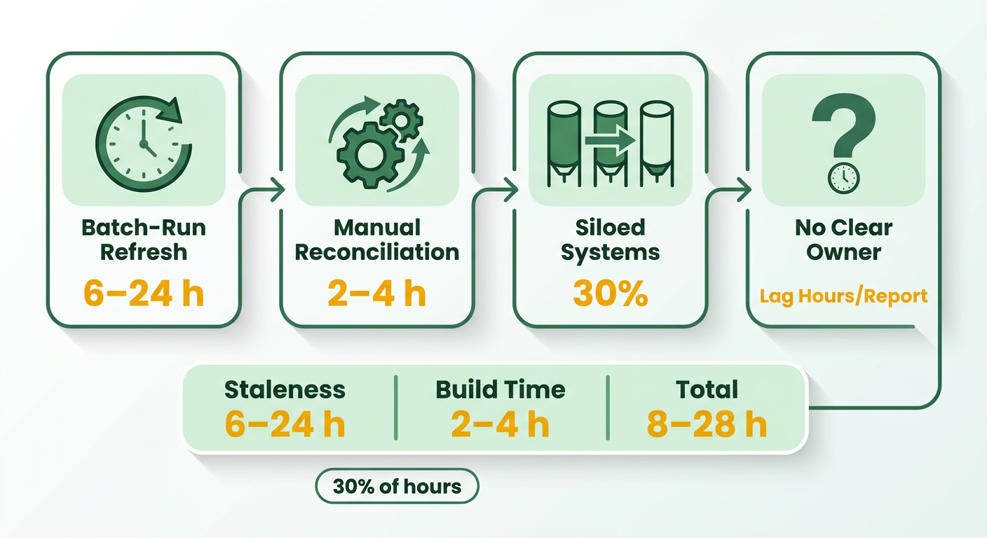
Why Batch Cycles Break Real-Time Cash Visibility
Batch processing means data refreshes on a schedule, usually nightly, instead of the moment a transaction posts. So a payment that clears at 9 a.m. doesn’t touch the executive summary until the next overnight run. Your collectors already know the account paid. The CFO’s number still says it hasn’t.
That delay creates friction. When systems rely on scheduled exports, finance teams end up running ad-hoc reconciliation cycles all week just to confirm whether a high-value invoice settled. Skip those checks, and collectors risk calling clients who already paid, which burns goodwill and time.
Real-time data ingestion removes the friction. Update ledger balances as transactions occur, and both the executive dashboard and the collector’s worklist reflect the same financial reality at any given second.
Does On-Premise Security Cause Stale Summaries?
Sometimes, yes. On-premise deployments held a 59.7% share of the AR automation market, favored by larger organizations for data security. That same architecture often throttles the live data flow real-time dashboards need. The setup big enterprises chose to protect their data can be a hidden reason their CFOs read outdated cash pictures.
Security and data freshness don’t have to fight, though. The bottleneck usually sits in legacy database configs that restrict external queries to off-peak hours. Modern hybrid architectures can securely expose read-only replicas or event streams, which lets real-time reporting run without breaching the core database’s security perimeter.
If you’re locked into on-prem for compliance reasons, don’t force a cloud migration just to fix reporting. Focus on shrinking the batch window and building an event-driven feed off your core system.
How Hand-Offs and Ownership Kill Freshness
Cross-departmental hand-offs are where summaries fall out of sync mid-chase. Manual reconciliation and approval queues insert human wait time between a payment posting and the number updating. Sales flags a dispute, ops verifies it, finance re-keys it. By the time it lands, the chase has moved on.
It gets worse when each department keeps its own local copy of receivables data. Sales ops tracks disputes in the CRM, finance manages balances in the ERP. Without a single automated source of truth, those siloed spreadsheets diverge fast, and you get conflicting reports and delayed collections. Unify the data streams into one automatically reconciled platform and every department works off identical, real-time figures.
Turning Static Summaries into Live Dashboards
The gap between a payment event and an executive summary that reflects it isn’t just a reporting annoyance. It’s a cash-flow blind spot. Closing it means understanding where your AR data actually lives, how it moves, and what breaks that movement.
Where Your Collections Data Actually Lives
Most SaaS finance teams pull from at least four systems: a payment gateway (successful charges, failed retries, refunds), an accounting system (invoices, credit notes, reconciled balances), a CRM (contact history, account status, escalation notes), and sometimes a separate subscription or billing layer. Each has its own data model and its own update cadence. The data exists. Nothing connects these systems in real time.
When those sources push on different schedules, your CFO’s view is a composite of snapshots taken at different times. An account can show as current in the accounting system while the CRM already logs three unanswered outreach attempts. That drift is where collection decisions go wrong.
Batch vs. Streaming: The Refresh Decision That Actually Matters
Batch processing pulls data on a schedule: nightly, hourly, every few hours. It’s still the default for most legacy ERP and accounting integrations, and it bakes a structural delay into executive dashboards.
Event-driven streaming flips the model. Instead of asking “give me everything that changed since last night,” the system says “tell me the moment anything changes.” A payment clears, a webhook fires, the dashboard updates. A retry fails, same thing. The CFO’s summary reflects the actual state of receivables, not the state as of last night’s batch run.
The practical bridge between the two is webhooks plus a message queue. Your payment gateway fires an event when a charge succeeds or fails. That event hits a queue, gets processed, and updates the reporting layer within seconds. No polling, no batch window, no stale picture.
To keep security intact, modern enterprise setups use secure API gateways that expose real-time endpoints without exposing the underlying database. You hold your data governance and compliance line while still feeding live transactional updates to executive dashboards. A continuous pipeline turns reconciliation from a monthly chore into an automated background process.
Building a Unified Data Model Without a Full Engineering Team
You don’t need a custom pipeline to get most of the way there. Low-code integration tools can connect your payment processor, accounting system, and CRM through a shared event layer, routing payment events into a central view without bespoke code. The configuration work is real, but a finance ops person with some technical comfort can handle it.
The bigger decision is the data model itself. Every system has a slightly different definition of “overdue” or “paid.” Unify them. Agree that the AR dashboard uses the accounting system’s invoice status as the source of truth, with CRM activity appended. That’s what stops two parts of the same summary from contradicting each other.
On governance: the same live layer that speeds things up creates audit risk if you’re careless with it. Every payment event that touches the reporting layer should be immutable and timestamped at the point of ingestion. That log is your audit trail. It also lets you replay events if something fails mid-pipeline, which matters when the data feeds executive decisions.
Aligning Summary Updates With the Collection Workflow
A refresh cadence without ownership is just a wish. The fix is to attach a report-refresh step to the collection workflow itself, name a single owner for the numbers, and set an SLA for how fresh those numbers must be before anyone acts on them.
Getting that governance right is harder than it sounds. Research from Aberdeen Group found companies with formal data ownership policies resolve reporting discrepancies 3x faster than those without. A study by Ventana Research put data trust, not tool cost, as the top reason finance teams delay acting on dashboards. Governance is what turns a live number into a decision someone will actually stand behind. 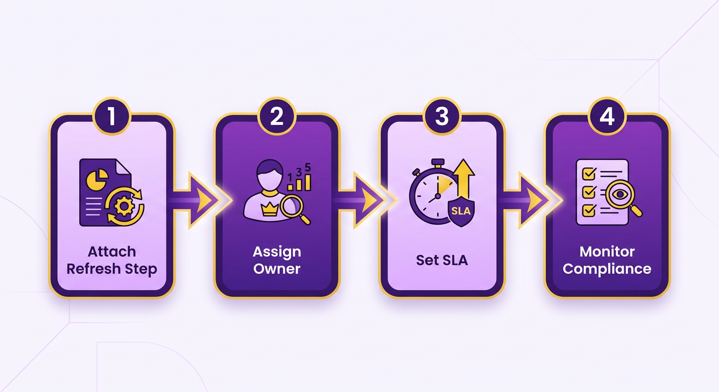
Who Owns the Executive Summary Report?
Ownership means one named person is accountable for report freshness, not the whole team. Assign it with a RACI split: the collections lead is Responsible for triggering refreshes, the finance manager is Accountable for the summary’s accuracy, the CFO is Consulted on thresholds, and collectors stay Informed via the live view.
To make that work, the owner has to draw a clear line between strategic and operational views. Instead of forcing one dashboard to show both high-level financials and granular collector notes, use role-based access. The CFO monitors portfolio health, the collections team works its prioritized lists, and both run off the same data engine.
What SLA to Set for Report Freshness
Report-freshness SLA: the maximum acceptable age of the data in a summary before a chase or a cash decision proceeds. Manual processes often tolerate day-old data. Active collections need a much tighter window. A target of under one hour keeps outreach based on current balances.
Build the refresh into the SOP as a hard gate. Before any outreach call, the collector confirms the account status reflects the latest payment events. No confirmation, no call. That single step keeps the collector from chasing an account that paid two hours ago, and keeps the CFO’s view honest at the same time.
For organizations with heavier compliance requirements, the SLA has to account for any security validation steps. If data has to pass through secure gateways or automated compliance checks, run those continuously rather than in delayed batches.
How to Signal Freshness to the CFO
Every summary the CFO opens should carry a timestamp and a version marker showing when the data last synced. No timestamp, no trust. A stale number that looks live is worse than a number the reader knows is old.
The review loop closes when the system automatically validates the live dashboard against the general ledger. Use automated matching engines to continuously pair incoming payments with outstanding invoices, and the reporting layer stays verified. That continuous check keeps the numbers audit-ready and lined up with the bank balance.
Proving Fresh Summaries Actually Improve Collections
The KPI that proves fresh summaries work isn’t “report accuracy.” It’s resolution-time compression and incremental cash recovered. When your executive summary reflects live payment data, collectors chase the right accounts sooner, and it shows up in your DSO and your bank balance.
The proof point we keep coming back to: Coca-Cola recovered $33.4 million with a resolution time of 34 days against a 90-day average. That’s not a reporting metric. That’s a 62% cut in how long cash sat unrecovered. For a SaaS CFO, that’s the before-and-after worth measuring. 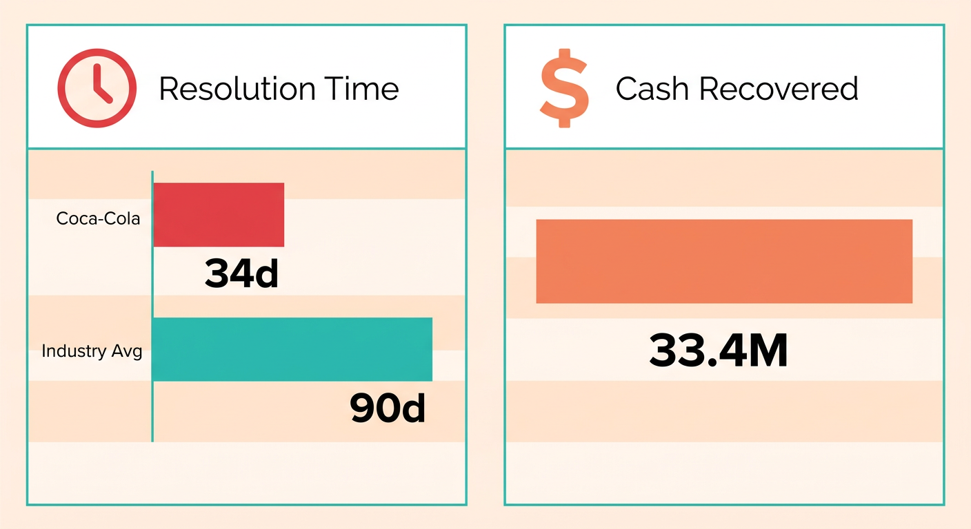
Which KPIs Actually Prove It
Track four metrics that tie report freshness directly to cash. Each moves when the lag between a payment event and your summary shrinks.
- Days Sales Outstanding (DSO): The average time to collect cash after a sale. Tracked over time, it tells you whether real-time visibility is speeding up the cash conversion cycle.
- Resolution time: How long from the moment an invoice goes past due to final settlement. Shorter times mean collectors are finding and clearing bottlenecks faster.
- Collector Effectiveness Index (CEI): The share of available receivables actually collected in a period. It tells you whether faster data is turning into faster chases.
- Incremental cash recovered: The extra dollars pulled in after fresh summaries went live, measured against your prior baseline.
Read DSO and resolution time together for the full picture. DSO reflects broad portfolio health; resolution time measures the efficiency of individual outreach. If DSO improves while resolution times stay flat, something external, not your operations, may be driving the change.
How to Run a Before-and-After Analysis
Set a clean baseline before you flip on real-time summaries, then compare the same window after. The trick is holding everything else constant so the freshness change is what you’re actually measuring.
Pick a 60-to-90-day window before automation and log your DSO, resolution time, and total cash recovered. Run the identical window after. A paired comparison on the same accounts, or a period-over-period read, isolates the report change from seasonal swings in your billing.
Konica Minolta gives you a second angle. After automating receivables, credit controller coverage improved 33% and productivity rose over 50%, landing $1.3 million in annual interest savings. That’s the operational side of the same story: fewer hours lost to manual reporting means more accounts worked per collector.
What the ROI Looks Like for a CFO Building the Case
The ROI case writes itself when you convert time saved into cash accelerated. One consumer-goods finance team saw a decline in costs while productivity climbed. Tie that to your own baseline and the automation spend justifies itself.
The AR automation market is projected to grow from $3.2 billion** to **$10.0 billion by 2033, a 12.1% CAGR. That signals where finance teams are putting budget. But adoption on its own isn’t the metric your board wants.
For very low transaction volumes or minimal outstanding receivables, a detailed before-and-after may not be worth the effort. But for mid-market SaaS companies running complex billing cycles and real collections risk, tracking these operational gains gives you the financial justification the investment needs.
For the mechanics of building the underlying view, our guide on building a collections summary that names who to chase next walks through the data layer these KPIs depend on.
Frequently Asked Questions
1. How often should a collections report refresh during an active chase?
During active outreach, reports should update continuously to prevent collectors from contacting clients who have already settled their balances. Establishing real-time data feeds ensures that the team always operates with the most current ledger information, eliminating the risk of redundant or awkward customer communications.
2. Can one report work for both the CFO and the collections team?
Attempting to use a single document for both strategic oversight and daily operations usually fails. Executives require high-level portfolio trends, while collectors need actionable, account-specific details. The best approach is to generate role-specific dashboards from a single, unified database to maintain consistency without sacrificing detail.
3. Does using an on-premise system for security automatically cause stale reports?
Security compliance does not have to limit reporting speed. While legacy on-premise setups often rely on delayed batch exports, modern hybrid architectures can securely stream transactional updates to reporting dashboards. This allows organizations to maintain strict data controls while still providing leadership with real-time cash visibility.
4. What extra metrics do subscription businesses need beyond a standard aging report?
Subscription models must track metrics that reflect long-term customer value rather than just immediate outstanding balances. Incorporating indicators like recurring revenue exposure and customer retention risk helps prioritize collections efforts based on the total projected impact on future cash flow.
5. How does batch processing differ from event-driven streaming for reporting?
Batch processing updates data at set intervals, which inevitably introduces a delay between a transaction occurring and appearing on a report. Event-driven streaming, however, pushes updates instantly as they happen. This ensures that executive dashboards always reflect the exact current state of receivables.
6. Why does a fresh report only matter if reconciliation is done first?
Without continuous reconciliation, real-time dashboards will display unapplied payments and incorrect outstanding balances. Ensuring that incoming transactions are automatically matched to their corresponding invoices is essential for maintaining data integrity and providing leadership with trustworthy reports.
7. What’s the cost of relying on manual reporting cycles instead of automated alerts?
Manual reporting cycles delay the identification of delinquent accounts, leading to slower escalation and higher bad-debt write-offs. Additionally, the administrative burden of manually compiling these reports diverts valuable finance resources away from strategic cash-flow management and active recovery efforts.