

Draft a Cash Flow Summary That Flags At-Risk Invoices First

Key Takeaways
- A cash flow summary that flags at-risk invoices first works like an early-warning system, not a rear-view total of what’s outstanding.
- Slow payers strangle working capital. One delayed enterprise invoice can disrupt operating cash and, in a bad month, payroll.
- Watching DSO move across three straight months tells you far more than any single-month snapshot.
- A growing AR balance can look like revenue growth while it’s quietly tying up cash you can’t spend.
- Scoring invoice risk means watching two things at once: portfolio-level trends and individual customer payment odds.
- Predictive models are only as good as the ledger data feeding them, which is why centralized billing and automated reconciliation matter.
Why flag the risky invoices first instead of last
Flip the order most finance teams use, and you get a report that actually warns you.
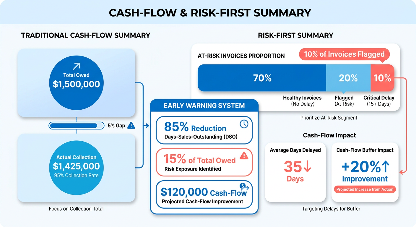
Here’s the usual sequence: calculate total receivables, then react when the money doesn’t show up. That’s a backward-looking total dressed up as an executive summary. Reverse it, surface the invoices most likely to default before they hit your bank balance, and the same report becomes an early-warning system.
The pain from late payments is immediate. Inconsistent customer remittances are one of the most common threats to working capital. When your cash buffer is thin, a single big invoice sliding from 30 to 60 days forces real trade-offs. Do you pay the vendor or make payroll?
Why early visibility beats a month-end summary
Early visibility buys you time, and time is the only thing that works on a slow-paying account. When DSO climbs steadily over three months, that trend is a much more reliable signal than any single month-end number. Measure it against your historical benchmarks, and you can tighten credit terms before small delays turn into write-offs.
A growing AR balance is the trap. It looks like healthy commercial growth. Often it’s the opposite: collection efficiency getting worse. One company watched its receivables climb from $13.5 million to $14.5 million year over year. That’s a million dollars of balance-sheet capital locked up, doing nothing. A risk-first summary catches that friction while you can still renegotiate terms.
Which metrics actually signal invoice risk
You have to watch risk at two altitudes: high-level portfolio metrics and granular, invoice-by-invoice variables. Pair portfolio DSO trajectory with individual payment probabilities, and you can move on emerging threats before the aggregate numbers ever look distressed.
| Metric | Definition | Data Source | Refresh Cadence | Impact Indicator |
|---|---|---|---|---|
| Days past due | Days elapsed beyond the invoice due date | AR aging report | Weekly | Rising days = collection difficulty |
| DSO trend | 3-month direction of days sales outstanding | Historical AR averages | Monthly | Sustained climb flags risk |
| AR aging concentration | Share of balance in 60- and 90-day buckets | Aging report | Weekly | Shift past 60 days = higher default odds |
| Payment-trend score | Change in a customer’s recent payment behavior | Payment history | Per payment event | Sudden slowdown signals internal strain |
| Disputed amount | Dollar value tied to open invoice disputes | Invoice records | On dispute | Frequent disputes delay payment, erode trust |
| At-risk probability | ML-scored likelihood an invoice pays late | Historical invoice data | Real-time | High score = prioritize collection now |
Can AI flagging replace human review?
Short answer: no, but it earns its keep.
Predictive models trained on historical payment logs are genuinely good at pushing high-risk accounts to the top of the follow-up list. What they can’t do is replace judgment. They can misread artificial timing. An aggressive collection push right before a quarter closes can temporarily hide credit deterioration, and a model will happily score that as a positive trend. Someone with experience has to check the anomalies.
And the whole thing depends on integration. A flagging engine only works when it’s wired into your accounting system with clean, current data. Blixo, for one, pairs its matching algorithms with automatic ledger reconciliation so the predictive models aren’t scoring stale records.
Collecting and organizing invoice data so the forecast holds up
Predictive accuracy rises and falls with the quality of the data going in. Before any automated flag can spot a vulnerable balance, you need one unified place that pulls records from every point where you touch a customer. Errors down here don’t stay down here — they surface in your executive reporting.

Good forecasting needs real-time tracking across accounts, entities, and currencies. For recurring billing, standardized records aren’t optional — inconsistent inputs make risk scoring meaningless.
What invoice fields does a cash flow model actually need?
Core attributes come first. Every model needs the same baseline inputs to project timing and calculate risk: issuance date, contractual due date, total value, currency code, and a unique customer identifier. Standardize those customer IDs across every system, or you can’t assess client exposure or read historical payment patterns.
Then layer payment history on top. Full settlement records, partial payments, actual days-to-pay — all of it adds context. Partial payments in particular deserve a second look. A customer paying half an invoice is often signaling a cash constraint or a quiet dispute weeks before the account goes fully delinquent.
Auxiliary fields sharpen the picture further: credit limits, active disputes, specific payment terms. Because unresolved billing disputes correlate directly with delayed settlement, tracking dispute count per account is a cheap, reliable indicator of friction heading your way.
How do you consolidate multi-source, multi-currency data?
Pull records from your ERP, sub-ledgers, and payment gateways into one repository. Convert foreign-currency transactions into your reporting currency using daily exchange rates, but keep the original values so your audit trail stays intact.
Real-time visibility depends on automated processing. When payment gateways and the general ledger fall out of sync, the lag means your predictive engine is scoring yesterday’s information. Sync the feeds and your cash balances actually reflect what’s settled.
Automated cash application does the heavy lifting here. Matching incoming bank deposits straight to open receivables removes the manual-entry delay and hands clean inputs to everything downstream.
Which data-quality checks protect your flags?
Data-quality checks are the automated rules that keep corrupted or incomplete entries from poisoning the forecast. Run duplicate screening, field validation, and anomaly detection before every refresh. Unspotted duplicates inflate projected inflows; a missing due date wrecks your aging calculation.
Validate at both levels. Confirm that historical averages reflect real payment cycles, and check that line-item details carry complete customer metadata.
Teams tightening their data pipelines can dig into RPA in accounts receivable automation. Clean inputs are the non-negotiable foundation for all of it.
Building a forecast model that accounts for at-risk balances
A risk-adjusted forecast works on two axes: project baseline inflows over set periods, then discount specific balances by their non-payment probability. That turns a standard projection into something closer to a realistic collections estimate.

Three layers make it work: a baseline inflow schedule, an invoice-level probability adjustment, and stress tests to see where the shortfalls could open up.
How do you weight risky invoices in the forecast?
Risk-adjusted inflow is just face value times probability of timely collection over the horizon. A $10,000 receivable with a 70% collection probability contributes $7,000 to expected short-term cash. Apply that discount across every open item, and you stop overestimating the liquidity you actually have.
The right modeling approach depends on the question. Deep learning classifiers are strong at reading historical patterns and assigning a binary risk label to an invoice — will it default or not.
Discrete survival analysis answers a different question. It models when an invoice settles, not just whether it defaults. For weekly cash positioning, survival methods are more useful. For prioritizing which accounts to chase, the binary classifier does the job.
What forecast horizon should a SaaS team use?
Run rolling forecasts at 30, 60, and 90 days at the same time. The 30-day window governs immediate spending — payroll, vendors. The 90-day horizon exposes the slow bleed: accounts that systematically stretch their terms by a few weeks each cycle.
Pairing short-term liquidity planning with longer trend analysis is how you catch systemic delays early. Prioritize follow-up by account probability score, and you can resolve the friction well before quarter-end close.
That kind of visibility compounds. Track collection metrics consistently, and you get better at setting credit rules and shrinking total overdue balances across the book.
How do you stress test the summary?
Model the bad scenarios. Bump default probabilities by 10% and see what happens to your working capital reserves. If a drop in collection rates pushes your quick ratio below 1.0, your liquid assets no longer cover short-term liabilities — that’s your signal to intervene on credit before it’s a crisis.
Reading the output, stay honest about what the model can’t see. It reads historical patterns. It doesn’t recognize deliberate period-end balance-sheet management, like an artificial collection push timed to hit a reporting target.
And it all rests on synchronization. If the data feeds stall or reconciliation lags, the forecast loses its predictive value fast.
Automating the flagging itself
Automated monitoring runs two engines together: deterministic business logic and probabilistic machine learning. Rule-based triggers catch the obvious policy violations instantly. Statistical models catch the subtle behavioral shifts before an account goes delinquent.

Run both, and you get a working queue — collection resources pointed at the accounts with the most money at risk.
What rule-based triggers should you set first?
Rule-based flag: an automated threshold that tags an invoice for review the moment a parameter is breached. Transparent, instant, no black box.
Three foundational rules to start with:
- Flag balances crossing from standard terms into extended aging (60+ days).
- Tag accounts where total exposure exceeds credit limits.
- Highlight customers whose cash conversion cycle stretches 10 days or more across consecutive quarters.
Then track behavior. Irregular payment amounts, an unannounced change in payment frequency, repeated billing queries — these often precede a formal default and warrant fast follow-up.
How accurate are AI models at predicting late payments?
Models trained on verified ledger data give reliable early warnings on likely delays, which lets collection teams get ahead of problem accounts instead of reacting to them.
Which algorithm depends on the goal. ML classifiers hit high precision for binary default calls. Discrete survival analysis gives you nuanced predictions about actual settlement dates across billing cycles.
Targeting workflows by risk score beats generic calendar-based follow-up. Focus the effort on high-risk balances, and you get more out of the team and fewer write-offs.
Where do the models fall short?
They’re blind to systemic risk when they only look at one invoice at a time. A model might score a big enterprise client as low risk on a spotless payment history — while completely missing that this one account is an unsafe share of your total AR.
Concentration has to be watched with its own rules. Lean only on invoice-level scores, and you’re exposed if a primary customer suddenly hits financial trouble.
One more habit worth keeping: log the automated flags, client communications, and payment adjustments. That audit trail feeds model retraining and shows you how collection performance actually moves over time.
Designing a real-time cash-flow summary dashboard

A good risk dashboard sorts accounts by exposure, not by balance size. Put the at-risk items up top, and a finance officer can read the liquidity threats within seconds of opening it.
The top of the screen belongs to a risk-prioritized queue — open receivables ranked by default probability. Right below it, net cash flow trajectories and DSO trends give the portfolio context.
What KPIs belong on a cash-flow risk dashboard?
Balance operational liquidity metrics against portfolio-vulnerability indicators. Four cover the ground:
- Net projected cash flow
- DSO multi-period trend
- Percentage of total receivables flagged high-risk
- Concentration ratio of balances in extended aging buckets
Show DSO as a moving trend, not a single day, so a one-off blip doesn’t get read as a problem. Chart the trajectory against your internal performance bands, and structural drift shows up well before the books close.
Concentration needs its own visual. Over-reliance on a handful of clients is how default risk turns catastrophic. Surface that concentration early, and you don’t repeat it.
How should you color-code risk without losing accessibility?
Keep it to three tiers: green for low, amber for moderate, red for high priority. Simple tiers process fast.
Color alone isn’t enough. Pair it with a second signal for anyone with a color-vision deficiency — distinct icons, plain text tags like “High Risk,” or fixed sort position so the critical alerts stay obvious no matter the display.
What makes the dashboard actually actionable?
An actionable dashboard lets you drop from a top-line metric straight into an account’s history. Click a flagged receivable, and you should immediately see its payment trend, open invoice detail, and communication log.
Tight data integration is what makes that possible. Automated matching platforms can reconcile routine bank transactions without anyone touching them, which frees your people to work the high-risk accounts.
Real-time visibility protects your operating buffer, and the buffer is thinner than most people assume. The median small business holds fewer than 27 days of cash reserves. At that margin, early risk detection isn’t a nice-to-have.
Best practices, common pitfalls, and scaling it
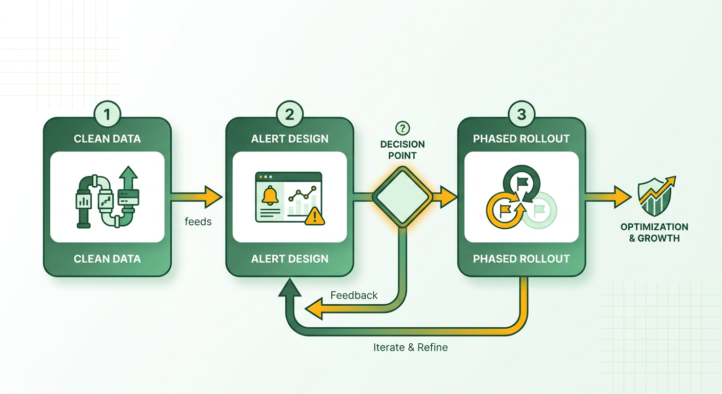
A risk-focused cash management framework survives on three habits: clean ledger data, clear alert thresholds, and a controlled rollout. The projects that fail almost always fail on the first one — bad data integration, which quietly degrades the flags over time.
What causes at-risk flagging projects to fail?
Data fragmentation is the number-one killer. As volume scales across separate billing systems, small record discrepancies compound fast. A mid-sized distributor running three billing platforms can find mismatched customer IDs in open invoices. Those mismatches spawn duplicate account profiles that hide severely aged balances for two full quarters.
Second failure mode: trusting summary totals without looking underneath. Aggregate metrics can mask emerging credit risk when a few healthy accounts temporarily offset the deteriorating ones.
And keep humans in the loop. Algorithms are excellent at spotting standard deviation patterns. They’re not the ones who should be judging complex commercial exceptions and manual adjustments — that still takes an experienced analyst.
How do you prevent alert fatigue?
Too many notifications kill a dashboard. If minor deviations fire off constant alerts, collection teams start ignoring the warnings, and then the whole system is decorative.
Set a clear hierarchy:
- Tier 1 (Critical): High individual default probability plus a negative portfolio DSO trend. Immediate outreach.
- Tier 2 (Warning): Single-indicator breaches, like a credit-limit overrun. Routed to daily operational queues.
- Tier 3 (Informational): Minor aging shifts. Summarized in weekly reviews.
Tiering keeps the urgency real for genuine risk while the routine stuff stays organized.
How should you phase in the rollout?
Three phases: pilot, departmental expansion, enterprise deployment. Start the pilot on a defined client portfolio using baseline metrics you already trust.
System readiness checklist:
- Centralized data pipelines with automated ledger reconciliation.
- Dual-level monitoring live (portfolio trends and invoice scoring).
- Alert severity tiers configured with notification batching.
- Exception workflows defined for manual analyst review.
- Finance, sales, and executive management aligned.
Staggering the rollout keeps operations stable. Wire risk monitoring into automated collections and you get a responsive loop — high-risk accounts routed to resolution before the cash flow ever takes the hit.
Frequently Asked Questions
1. Should I flag partial payments as at-risk, or wait until an invoice is fully overdue?
Flag partial payments as soon as they occur. Short-paying an invoice often signals emerging liquidity challenges or unresolved billing disputes. Identifying these events early provides an opportunity to negotiate settlement terms before the account becomes severely delinquent.
2. Is a high DSO reading always a problem?
A single elevated DSO reading is not necessarily alarming, as large individual payments can temporarily skew monthly results. The critical signal to monitor is a sustained upward trend across consecutive quarters, which indicates systemic collection slowdowns.
3. Should I use deep learning or survival models to score invoice risk?
Select your analytical model based on the core operational requirement. Deep learning algorithms provide superior accuracy for binary risk tagging (default vs. non-default). Discrete survival models are preferable when projecting expected payment dates to construct cash timing schedules.
4. Can a per-invoice risk model catch concentration risk?
No. Invoice-level algorithms evaluate individual transactions independently and cannot detect overall portfolio balance distribution. Concentration tracking requires dedicated portfolio-level monitoring to flag instances where a single client holds an unsafe percentage of total open credit.
5. Why does a growing receivables balance sometimes signal trouble instead of growth?
An expanding receivables balance may reflect slowing collection velocity rather than expanding sales volume. When payments delay, working capital becomes trapped on the balance sheet, impairing liquidity even while top-line revenue appears strong.
6. How many alert tiers should I set to avoid overwhelming my team?
Structure notifications into three clear severity tiers: critical alerts requiring immediate action, moderate warnings routed to daily task queues, and minor updates consolidated into weekly management summaries.
7. Why can’t AI flagging run without a centralized data platform?
Predictive algorithms require continuous, accurate ledger updates to compute valid risk scores. Without centralized data integration and automated reconciliation, algorithms evaluate stale settlement records, leading to inaccurate risk scores and missed collection priorities.